Design Principle: Exercises
Design Principle: Exercises
Ameera Rihana 0352511

Instructions
Recap of exercises
Contrast
- Juxtaposition of strongly dissimilar elements.
- Without contrast, visual experience would be monotonous.figure 0.01
Gestalt theory
- The human brain is wired to see patterns, logic and structures.
- "Gestalt" refers to "shape" or "form" in German.figure 0.02
Balance
- Balance refers to the distribution of visual weight in a work of design.
- It is the visual equilibrium of the elements that causes the total image to appear balanced. figure 0.03

Emphasis
- Emphasis is used to create dominance and focus in a design work.
- Various elements can be used to create emphasis, such as color, shapes or value to achieve dominance.figure 0.04

Repetition
- Repetition could make a work of design seem active.
- The repetition of elements of design creates rhythm and pattern within the work.figure 0.05

Movement
- The way a design leads the eye in, around, and through a composition which is the path the eye follows.
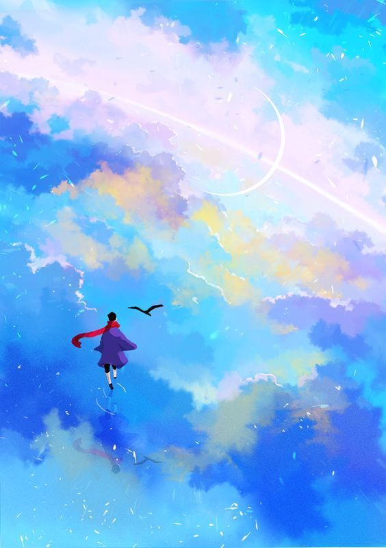
- Motion or movement in a visual image occurs when objects seem to be moving in a visual image.figure 0.06

Harmony
- Harmony involves the selection of elements that share a common trait.
- Harmony becomes monotony without variety.figure 0.07

Unity
- Refers to the repetition of particular elements throughout your design whether they're colors, shapes or materials to pull the look together.
- Although unity and harmony may sound similar, they each play distinct roles in the way we experience design.figure 0.08
Symbol
- A sign, shape, or object that is used to represent something else.
- In design, symbols can provide or convey information, equivalent to one or more sentences of text, or even a whole story.

figure 0.09
Word and Image
- Choosing the right words to pair with the imagery is of high importance as it would deepen the meaning of the design. Suitable typeface and strategic positioning of the type will result in visual hierarchy and balance in a work of design.
- Typography is the design arrangement of text to convey a message or concept.
figure 0.10

Week 1- 4
 figure 2.1
 figure 2.2
I decided to add more elements into the collage to bring out more colors and make the contrast more obvious and clearer to the eye. I have cut them in circular shapes and irregular shapes of different backgrounds to make it more exciting.
 figure 2.3
I added more circular shapes in between into the collage to make it look balance and less empty.
Final Design figure 2.4
The reason I choose contrast is because I want to simply improve my understanding on this principle as I find it difficult to differentiate the concept between contrast and emphasis. Collage is one of the things that I would like to get used to it and therefore I am taking this opportunity to try it.
Compare to my previous attempt, I decided to take a photo of my mother whom I love and cherish very much. It seems to be one of the best choice I could think of as I was inspired and determined to create this piece. I decided to show the contrast in colors between my mother and the elements so that the people would be able to identify the differences easily and makes it look satisfying to the eye.
 figure 3.3 water and bubble movement
Designs
 figure 3.4 shows sketch 1
 figure 3.5 shows sketch 2
In this first sketch, I was told that it does not really suit the movement principle. Therefore, I created another sketch to show more accuracy in movement. I decided to further my progress in sketch 2.
Final Design

figure 3.6
When I see movement, I think of water. Motion or movement in a visual image occurs when the jellyfish and water seem to be moving in a visual image. I create distance between the jelly fish and putting them in different sizes (small to big) as an object tends to bigger in a close distance when an object tends to be smaller at a further distance. I tried to manipulate the water by using irregular shapes and lines to emphasis movement. I decided to abandon the meteorite and go for a different angle by using jellyfish.
During the first week, a module brief was given by our lecturer about the
first task that we needed to do. We were introduced by many design
principles and thus we have to pick three principles to apply on our three
designs respectively.
1. Gestalt theory
1. Gestalt theory
2. Contrast
3. Emphasis
4. Balance
5. Repetition
6. Movement
7. Harmony & Unity
8. Symbol
9.Word and Image
9.Word and Image
Three design principles I choose:
1. Contrast
Contrast can provide visual interest, emphasis a point and express content. It is a contradiction in color that makes an object distinguishable. They are arranged in juxtaposition in order to be strikingly different from one another.
Contrast can provide visual interest, emphasis a point and express content. It is a contradiction in color that makes an object distinguishable. They are arranged in juxtaposition in order to be strikingly different from one another.
Visual references
Designs


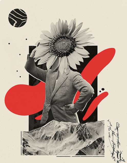
I have attempted a digital collage to create my contrast design. My intention is to bring emphasis and focus on the colors from a person's perspective. I have put them in juxtaposition to show its contrast.
I have found a picture of my mother that represents a shadow which includes black and white. I decided to change the filter of the picture to black and white. I cut the picture using a lasso tool to remove the background.
I decided to add more elements into the collage to bring out more colors and make the contrast more obvious and clearer to the eye. I have cut them in circular shapes and irregular shapes of different backgrounds to make it more exciting.
I added more circular shapes in between into the collage to make it look balance and less empty.
Final Design
The reason I choose contrast is because I want to simply improve my understanding on this principle as I find it difficult to differentiate the concept between contrast and emphasis. Collage is one of the things that I would like to get used to it and therefore I am taking this opportunity to try it.
Compare to my previous attempt, I decided to take a photo of my mother whom I love and cherish very much. It seems to be one of the best choice I could think of as I was inspired and determined to create this piece. I decided to show the contrast in colors between my mother and the elements so that the people would be able to identify the differences easily and makes it look satisfying to the eye.
2. Movement
Motion or movement in a visual image occurs when object seems to be moving in a visual image. It can comes from the kinds of shapes, forms, lines, and curves that are used. Motion can also be seen through colors. It is the way a design leads the eye in, around, and through a composition which is the path the eye follows.
Motion or movement in a visual image occurs when object seems to be moving in a visual image. It can comes from the kinds of shapes, forms, lines, and curves that are used. Motion can also be seen through colors. It is the way a design leads the eye in, around, and through a composition which is the path the eye follows.


Designs
Final Design
figure 3.6
When I see movement, I think of water. Motion or movement in a visual image occurs when the jellyfish and water seem to be moving in a visual image. I create distance between the jelly fish and putting them in different sizes (small to big) as an object tends to bigger in a close distance when an object tends to be smaller at a further distance. I tried to manipulate the water by using irregular shapes and lines to emphasis movement. I decided to abandon the meteorite and go for a different angle by using jellyfish.
3.Emphasis
Emphasis is used to create dominance and focus in a design work. Various elements can be used to create emphasis, such as colors, shapes or value, to achieve dominance.
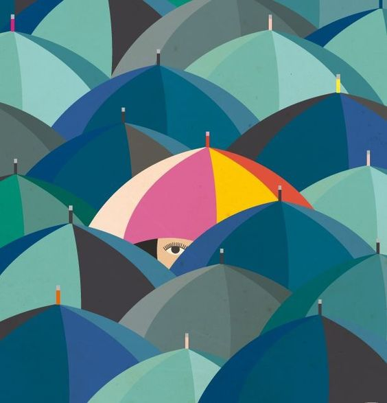 figure 4.2 Umbrella in disguise
 figure 4.3 Red Umbrella
Designs
 figure 4.4 shows a sketch
 figure 4.5 shows the process
Firstly, I created the outline by tracing the sketch and fill it with sky blue color and the umbrella with pink color using adobe illustrator. The cause behind this is to create emphasis through shapes and colors in order for the umbrella to achieve dominance in this design. Furthermore, I attempted to create shadows with darker shades of color to give a bit of solid shape.
After that, I fill out the eyes and the mouths with a dark shade of grey to complete the faces of the cats. I rearranged them accordingly to the angle of the figure of each cats. Finally, a darker shade of blue is placed beneath the clowders of cats in order to form a shadow. This will give a complete look for the final design. I decided to alter the sketch by creating a bigger umbrella to build a greater emphasis.
Final design

figure 4.6 final design
Initially, there are a lot of ideas I can use for emphasis but I decided to go for this route. This is because I naturally love cats and I was hoping I could relate something I love to emphasis. When I looked for visual references, I instantly clicked with them and thought of combining all of it together with improvisation. I choose sky blue and pink because I was looking for pastel colors and I do not want it to be striking. In addition, I was recently introduced to adobe illustrator and there I was trying to test and hone my skills in this type of media.
Feedbacks
Reflection
Throughout these four weeks, understanding the concept and the definition of design principles are simple. However, I realize that that to apply those design principles into our artwork and identify them are quite a challenge. It took me awhile to get familiarized with their concept and ideas. It takes me quite an extensive research to scroll through in order to find suitable visual references and put them into my compilation. I tend to question myself whether this is a good reference or whether the design principle that I am looking for is the right one. But as I progressed, I manage to find a pattern to each of those design principles. For example, it gives me a clearer vision about the differences between contrast and emphasis.
Emphasis is used to create dominance and focus in a design work. Various elements can be used to create emphasis, such as colors, shapes or value, to achieve dominance.

Designs
Firstly, I created the outline by tracing the sketch and fill it with sky blue color and the umbrella with pink color using adobe illustrator. The cause behind this is to create emphasis through shapes and colors in order for the umbrella to achieve dominance in this design. Furthermore, I attempted to create shadows with darker shades of color to give a bit of solid shape.
After that, I fill out the eyes and the mouths with a dark shade of grey to complete the faces of the cats. I rearranged them accordingly to the angle of the figure of each cats. Finally, a darker shade of blue is placed beneath the clowders of cats in order to form a shadow. This will give a complete look for the final design. I decided to alter the sketch by creating a bigger umbrella to build a greater emphasis.
figure 4.6 final design
Initially, there are a lot of ideas I can use for emphasis but I decided to go for this route. This is because I naturally love cats and I was hoping I could relate something I love to emphasis. When I looked for visual references, I instantly clicked with them and thought of combining all of it together with improvisation. I choose sky blue and pink because I was looking for pastel colors and I do not want it to be striking. In addition, I was recently introduced to adobe illustrator and there I was trying to test and hone my skills in this type of media.
Feedbacks
Overall feedback:

figure 5.1
I was told that images or pictures from the internet are not allowed to use. Therefore, I was advised to change it by using my own pictures that I took and alter it into my own design. Besides that, the flowers were distracting the idea of contrast which was implied as too much.
The grey background did not help as it reduced the contrast between the man and the elements thus changed it to white. I only had to focus on the black, white and red color to show more contrast. Lastly, too much space was left beneath the A4 template and did not appear to be in the center.
figure 5.2
It was a good concept but a few adjustments needed to be made. The umbrella that was initially small needs to be bigger and create more space for the umbrella by adjusting the position of the cats. I was given a choice if I wanted to add tiny cats at the bottom of the template but it was not necessary. Based on the visual reference, I was told not to copy the color theme and use a different one. The cats are very cute.

figure 5.3
The meteorite did not seem applicable in the movement principle. I was told to find more visual reference about the meteorite that is more suitable for my design.
figure 5.4
In my first attempt, the flow of water did not seem smooth thus the movement or the motion was not visible enough in the sketch. The composition was not accurate and the attempted meteorite did not look like one because it looked like water. I was told to remove the flow at the bottom of the template and adjust the position of the meteorite and extended it longer. I was advised to use color directions to assist me in applying movement.
figure 5.1
I was told that images or pictures from the internet are not allowed to use. Therefore, I was advised to change it by using my own pictures that I took and alter it into my own design. Besides that, the flowers were distracting the idea of contrast which was implied as too much.
The grey background did not help as it reduced the contrast between the man and the elements thus changed it to white. I only had to focus on the black, white and red color to show more contrast. Lastly, too much space was left beneath the A4 template and did not appear to be in the center.
figure 5.2
It was a good concept but a few adjustments needed to be made. The umbrella that was initially small needs to be bigger and create more space for the umbrella by adjusting the position of the cats. I was given a choice if I wanted to add tiny cats at the bottom of the template but it was not necessary. Based on the visual reference, I was told not to copy the color theme and use a different one. The cats are very cute.
figure 5.3
The meteorite did not seem applicable in the movement principle. I was told to find more visual reference about the meteorite that is more suitable for my design.
In my first attempt, the flow of water did not seem smooth thus the movement or the motion was not visible enough in the sketch. The composition was not accurate and the attempted meteorite did not look like one because it looked like water. I was told to remove the flow at the bottom of the template and adjust the position of the meteorite and extended it longer. I was advised to use color directions to assist me in applying movement.
Reflection
Throughout these four weeks, understanding the concept and the definition of design principles are simple. However, I realize that that to apply those design principles into our artwork and identify them are quite a challenge. It took me awhile to get familiarized with their concept and ideas. It takes me quite an extensive research to scroll through in order to find suitable visual references and put them into my compilation. I tend to question myself whether this is a good reference or whether the design principle that I am looking for is the right one. But as I progressed, I manage to find a pattern to each of those design principles. For example, it gives me a clearer vision about the differences between contrast and emphasis.
I am grateful to be a part of this class as I get to recap and learn all the importance of design principle. It refreshes my ideas and broaden my horizon to assist me on my design journey. In addition, the classes have been exciting and it gives off a positive atmosphere so far. I am quite thankful to have a kind lecturer that puts a lot of effort to help each and every single one of the students to bring out the potential and strength in their design. She is firm with her opinions but there is also a sense of politeness. Overall, I am determined to try and continue my chaos journey in design principle.
Comments
Post a Comment