Typography / Task 1: Exercise 1 & 2

04.04.2023 - 09.05.2023 / Week 1 - Week 6
Ameera Rihana binti Remy Ansara / 0352511
Typography / Bachelor of creative media (Hons)
Task 1: Exercises 1 & 2
LECTURES
WEEK 1 - LECTURE 1
Mr. Vinod gave us a brief introduction about typography and also the assignments that we have to do along the way. He also showed us a Facebook page where we are supposed to look for any new announcement or information. We were given a tutorial on how to create our e-portfolio through a blog. Specific instructions were given for us to follow throughout the entire semester.
LECTURES
- Typography: The art and technique of arranging type to make written language legible, readable and appealing when displayed.
- Font: The individual font or weight within the typeface.
- Typeface: The entire family of fonts or weights that share similar characteristics or styles.
Typography: Development and Timeline
1. Early letterform development: Phoenician to Roman

Fig. 1.1 4th Century B.C.E: Phoenicians votive stele Carthage, Tunisia.
The stele bears a four-line inscription to Tanit and Baal Hammon.
The writings are scratched into wet clay with sharpened sticks or
carving into stone with a chisel. The
form of uppercase letterforms (for nearly 2000 years the only letterforms) can be seen to evolved out
of these tool and materials. They are simple combinations of straight lines and pieces of circles.

Fig. 1.2 Evolution from Phoenician to Roman

Fig. 1.3 Phoenician to Roman

Fig. 1.4 Greek fragment, stone engraving. (Date unknown)
 Fig. 1.5 The direction of writing for the Greeks
2. Hand script from 3rd - 10th century C.E.

Fig. 1.6 4th or 5th century: Square Capitals
form of uppercase letterforms (for nearly 2000 years the only letterforms) can be seen to evolved out
of these tool and materials. They are simple combinations of straight lines and pieces of circles.
Fig. 1.2 Evolution from Phoenician to Roman
Fig. 1.3 Phoenician to Roman
Fig. 1.4 Greek fragment, stone engraving. (Date unknown)
Writing style
Phoenicians: Right to left
The Greeks: A style of writing called 'boustrophedon' (how the ox ploughs), which meant that the lines of text read alternately from right to left and left to right.
Phoenicians: Right to left
The Greeks: A style of writing called 'boustrophedon' (how the ox ploughs), which meant that the lines of text read alternately from right to left and left to right.
2. Hand script from 3rd - 10th century C.E.
Fig. 1.6 4th or 5th century: Square Capitals
Square capitals:
Letters can be found in Roman monuments. They have
serifs added to the finish of the
main strokes. The stroke width was achieved by the reed pen held at an angle of approximately 60
degrees off the perpendicular.

Fig. 1.7 Late 3rd - mid 4th century: Rustic Capitals
main strokes. The stroke width was achieved by the reed pen held at an angle of approximately 60
degrees off the perpendicular.
Fig. 1.7 Late 3rd - mid 4th century: Rustic Capitals
Rustic capitals:
A compressed version of square capitals, rustic
capitals allowed for twice as many words on a
sheet of parchment. A brush was held at angle of
approximately 30 degrees off the perpendicular.
Rustic capitals are easier and faster to do but
slightly harder to read due to their compressed
nature.

Fig. 1.8 4th - 5th century: Uncials
Fig. 1.8 4th - 5th century: Uncials
Uncial: Incorporated some aspects of the Roman
cursive hand. It is more accurate to think
Uncials as small letters. The broad forms of
uncials are more readable at small sizes than
rustic capitals.

Fig. 1.9 C. 500: Half-uncials
Fig. 1.9 C. 500: Half-uncials
Half-uncials: Mark the formal beginning of lowercase
letterforms, replete with ascenders and
descenders, 2000 years after the origin
of the Phoenician alphabet.

Fig. 1.10 C. 925: Caloline Miniscule
Fig. 1.10 C. 925: Caloline Miniscule
Caloline Miniscule:
Charlemagne, the first unifier of
Europe since the Romans, issued an
edict in 789 to standardize all
ecclesiastical texts. He entrusted
this task to to Alcuin of York,
Abbot of St Martin of Tours. The
monk rewrote the texts using both
majuscules (uppercase), miniscule,
capitalization and punctuation which
set the standard for calligraphy for
a century.

Fig. 1.11 C. 1300: Blackletter (Texture)
Fig. 1.11 C. 1300: Blackletter (Texture)
Blackletter: With the dissolution of
Charlemagne's empire came
regional variations upon
Alcuin's script. In northern
Europe, a condensed strongly
vertical letterform known as
Blackletter gained popularity.
In the south, a rounder more
open hand gained popularity,
called 'rotunda'. The humanistic
script in Italy is based on
Alcuin's miniscule.

Fig. 1.12 C. 1455: 42 line bible, Johann Gutenberg, Mainz
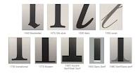
Fig. 1.13 Text type classification
Fig. 1.12 C. 1455: 42 line bible, Johann Gutenberg, Mainz
Blackletter to Gutenberg's
type:
Gutenberg's skills included
engineering, metalsmithing
and chemistry. He marshaled
them all to build pages that
accurately mimicked the work
of the scribe's hand. His
type mold required a
different brass matrix, or
negative impression, for
each letterform.
3. Text type classification
Fig. 1.13 Text type classification
WEEK 2: LECTURE 2
Typography: Text
1. Kerning and Letterspacing

Fig. 2.1 Kerning and Letterspacing
Kerning: The automatic adjustment of space between letters.
Letterspacing:
To add space between letters.
Tracking: The process of adding or subtracting space in a word or a sentence.

Fig. 2.2 normal tracking, loose tracking, tight tracking
 Fig. 2.3 flush left, ragged right
Tracking: The process of adding or subtracting space in a word or a sentence.
Fig. 2.2 normal tracking, loose tracking, tight tracking
Flush left: Closely mirrors the asymmetrical experience of handwriting.
Each line starts at the same point but ends wherever the last
word on the line ends. Spaces between words are consistent
throughout text, allowing to create an even gray value.

Fig. 2.4 centered, ragged right and left

Fig. 2.5 flush right, ragged left
Fig. 2.4 centered, ragged right and left
Centered:
Imposes symmetry upon the text, assigning equal value and
weight to both ends of any line. Transforms fields of text
into shapes, therefore adding a pictorial quality. It is
important to amend the line breaks so that the text does
not appear too jagged.
Fig. 2.5 flush right, ragged left
Flush right:
Places emphasis on the end of a line as opposed to its
start. Can be useful in situations (like captions) where
the relationship between text and image might be ambiguous
without a strong orientation to the right.
 Fig. 2.6 justified
3. Texture

Fig. 2.7 Anatomy of a Typeface

Fig. 2.8 Different examples of typefaces
Justified:
Imposes a symmetrical shape on the text like
centering. Achieved by expanding or reducing spaces
between words and between letters. The openness of
lines can occasionally produce 'rivers' of white space
running vertically through the text. Careful attention
to line breaks and hyphenation is required.
3. Texture
Fig. 2.7 Anatomy of a Typeface
Fig. 2.8 Different examples of typefaces
Figure 2.8 shows how each typefaces have different
gray values, some with darker strokes and lighter
strokes. An ideal text is to choose a typeface that
has the middle gray value or an even gray color. A
good typographer should consider to choose the best
typeface to convey the message properly. The goal is
to allow easy reading.

Fig. 2.9 leading and line length
Leading: Text that is set too tightly encourages vertical eye movement; a reader can easily loose his or her place. Type that is set too loosely creates striped patterns that distract the reader from the material at hand.
Line Length: Shorter lines require less reading; longer line more. Keep the line length between 55-65 characters. Extremely long or short line lengths impairs reading.
4. Leading and Line Length
Type size: Text type should be large enough to be read easily at arm's length.Fig. 2.9 leading and line length
Leading: Text that is set too tightly encourages vertical eye movement; a reader can easily loose his or her place. Type that is set too loosely creates striped patterns that distract the reader from the material at hand.
Line Length: Shorter lines require less reading; longer line more. Keep the line length between 55-65 characters. Extremely long or short line lengths impairs reading.
WEEK 3: LECTURE 3
5. Text- Indicating paragraph
Pilcrow (¶): A holdover from medieval manuscripts seldom use today.Line space (leading*): Cross alignment is achieved when the leading and the paragraph space are the same.

Fig. 3.1 leading vs line spacing

Fig. 3.2 standard indentation
Standard indentation:
The indent is the same size as line spacing or the same as the point
of your text. Indentation is best used when it is justified.

Fig. 3.3 extended paragraphs
Fig. 3.3 extended paragraphs
Extended paragraphs:
Creates unusually wide columns of text. Despite these problems,
there can be strong compositional or functional reasons for
choosing it.
6. Widows and Orphans
Widow:
A short line of type left alone at the end of a column of
text.
Orphan: A short line of type left alone at the start of new column.

Fig. 3.4 widow and orphan

Fig. 3.5 Highlighting text with quotation

Fig. 3.6 prime and quotation
6. Widows and Orphans
-Widows may be acceptable, but orphans are unacceptable.
Widow:
A short line of type left alone at the end of a column of
text.Orphan: A short line of type left alone at the start of new column.
Fig. 3.4 widow and orphan
7. Highlighting text
Fig. 3.5 Highlighting text with quotation
Quotation marks, like bullets, can create a clear
indent, breaking the left reading axis. Based on the
figure, the indented quote can be compared at the top
with the extended quote at the bottom.
Fig. 3.6 prime and quotation
A prime is not a quote. The prime is an abbreviation
for inches and feet. They are often substituted due to
the limitations number of keys in a typewriter. This
known as 'dumb quote'.
 Fig. 3.7 A heads
A head
indicates a clear break between the topics within
a section.

Fig. 3.8 B heads
Fig. 3.8 B heads
B heads
is subordinate to A heads. B heads indicate a
new supporting argument or example of the
topic at hand. They should not interrupt the
text as strongly as A heads do.

Fig. 3.9 C heads

Fig. 3.10 Hierarchy of subheads in proper sequence
Cross aligning
headlines and captions with text type
reinforces the architectural sense of the
page-the structure-while articulating the
complimentary vertical rhythms.

Fig. 3.11 Cross Alignments
Fig. 3.9 C heads
C heads
highlights specific facets of material
within B head text. The not materially
interrupt the flow of reading.
Fig. 3.10 Hierarchy of subheads in proper sequence
8. Cross Alignment
Cross aligning
headlines and captions with text type
reinforces the architectural sense of the
page-the structure-while articulating the
complimentary vertical rhythms.Fig. 3.11 Cross Alignments
Figure 3.11 shows one line of
headline type cross-aligns with two
lines of text type, and
(right; bottom left) four lines of headline type cross-align with five lines of text type.
(right; bottom left) four lines of headline type cross-align with five lines of text type.
WEEK 4: LECTURE 4
1. Describing letterforms
-Knowing a letterform's component parts make it much easier to identify
specific typefaces.
Fig. 4.1 Describing letterforms
- Baseline: The imaginary line the visual base of the letterforms.
- Median: Imaginary line defining the x-height of letterforms.
- X-height: Height in any typeface of the lowercase 'x'.
- Stroke: Any line that defines basic letterform
-
Apex/Vertex:
The point created by joining two diagonal stems
(apex above and vertex below) - Arm: Short strokes off the stem of the letterform
-
Ascender:
The portion of the stem of a lowercase letterform that projects
above the median. - Barb: The half-serif finish on some curved stroke.
- Beak: The half-serif finish on some horizontal arms.
- Bowl: The rounded form that describes a counter. It may be open or close.
- Bracket: The transition between the serif and stem.
- Cross Bar: The horizontal stroke in a letterform that joins two stems together.
- Cross Stroke: Horizontal stroke in a letterform that joins two stems together.
- Crotch: The interior space where two strokes meet.
- Descender: Portion of the stem of a lowercase letterform thatprojects below the baseline.
- Ear: Stroke extending out from the main stem or body of the letterform.
- Em: Distance equal to the size of the typeface.
- En: Half the size of an em.
- Ligature: Character formed by the combination of two or more letterforms.
- Link: Stroke that connects the bowl and loop of the lowercase G.
- Loop: bowl created in the descender of the lowercase G.
- Spine: The curved stem of the S.
- Stress: Orientation of the letterform, indicated by thin strokes in round forms.
- Swash: The flourish that extends the stroke of the letterform.
- Terminal: Self-contained finish of a stroke without a serif.
- Spur: Extension the articulates the junction of the curved and rectilinear strokes.
- Stem: The significant vertical or oblique stroke.
- Tail: The curved diagonal stroke at the finish of certain letterforms.
2. The font
-Uppercase and lowercase
-Small capitals
-Uppercase and lowercase numerals
-Italic
-Punctuation and miscellaneous characters
- Ornaments

Fig. 4.2 Small capitals


Fig. 4.4 Lowercase numerals

Fig. 4.6 Italic

Fig. 4.7 Punctuation and miscellaneous characters

Fig. 4.8 Ornaments
Used as flourishes in invitations or certificates. They are usually provided as a font in a larger type family.

Fig. 4.9 Describing typefaces
Roman: Derived from inscriptions of Roman monuments. Has a slightly lighter stroke.

Fig. 4.10 Comparing typefaces
Fig. 4.2 Small capitals
Uppercase letterforms draw to the x-height of the typeface.
Small Caps are primarily found in serif fonts as part what is
often called expert set.
Fig. 4.3 Uppercase numerals
Same height as uppercase letters and are all set to the same
kerning width. They are mostly used with tabular material or
uppercase letters.
Fig. 4.4 Lowercase numerals
Numerals are set to x-height with ascenders and descenders.
They are used when ever you would use upper and lowercase
letterforms.
Fig. 4.6 Italic
The forms in italic refers back to 15th century Italian
cursive handwriting. Oblique are typically based on the roman
form of the typeface.
Fig. 4.7 Punctuation and miscellaneous characters
Miscellaneous characters can change from typeface to
typeface. It is important to be familiarized with all the
characters available before choosing the appropriate
type.
Fig. 4.8 Ornaments
Used as flourishes in invitations or certificates. They are usually provided as a font in a larger type family.
3. Describing typeface
Fig. 4.9 Describing typefaces
Roman: Derived from inscriptions of Roman monuments. Has a slightly lighter stroke.
Italic:
Named from the 15th century Italian handwriting on
which the forms are based.
Boldface:
A thicker stroke than a roman form.
Light:
A lighter stroke than the roman form.
Condense: A version of the roman form, extremely condense
style called 'compressed'.
Extended: An extended variation of a roman font.
Extended: An extended variation of a roman font.
4. Comparing typefaces
Fig. 4.10 Comparing typefaces
The forms display a wealth of variety, in line
weight, relative stroke widths and in feeling.
WEEK 5: LECTURE 5
Typography: Letters
1. Understanding Letterforms

Fig. 5.1 Baskerville 'A'
The uppercase suggests symmetry, but it is not symmetrical. There are
two different stroke weights of the Baskerville stroke form, each
bracket connecting the serif to the stem has a unique arc.

Fig. 5.2 Univers 'A'
The uppercase suggests symmetrical, but the width of the left slope
is thinner than the right stroke. Both Baskerville and Univers
demonstrate the meticulous care of a designer to create letterforms
that are harmonious and individually expressive.

Fig. 5.3 Helvetica vs Univers
The complexity of each individual letterform is neatly
demonstrated by examining the lowercase 'a' of two seemingly
similar sans-serif typefaces- Helvetica and Univers. A comparison
of how the stems of the letterforms finish and how the bowls meet
the stems quickly reveals the palpable difference in character
between the two.
2. Maintaining x-height

Fig. 5.4 x-height, median and baseline
X-height: The size of the lowercase letterforms. The curved stroke, such
as in 's', must rise above the median or sink below the baseline
to appear to be the same size as the vertical and horizontal
strokes they adjoin.
3. Form / counterform

Fig. 5.5 Form / Counterform
Counterform (or counter) - the space describes, and often
contained, by the strokes of the form. When letters are joined
to form words, the counterforms includes the spaces between
them. How well words hang together depends on how well you
handle the counters when you set type. In other words, how
easily we can read it.
4. Contrast
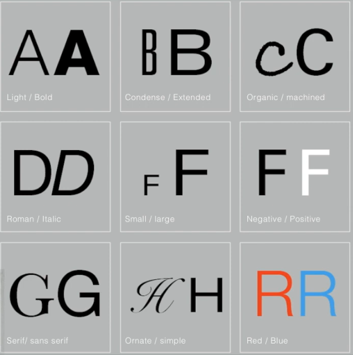
Fig. 5.6 Contrast
Fig. 5.1 Baskerville 'A'
Fig. 5.2 Univers 'A'
The uppercase suggests symmetrical, but the width of the left slope
is thinner than the right stroke. Both Baskerville and Univers
demonstrate the meticulous care of a designer to create letterforms
that are harmonious and individually expressive.
Fig. 5.3 Helvetica vs Univers
The complexity of each individual letterform is neatly
demonstrated by examining the lowercase 'a' of two seemingly
similar sans-serif typefaces- Helvetica and Univers. A comparison
of how the stems of the letterforms finish and how the bowls meet
the stems quickly reveals the palpable difference in character
between the two.
2. Maintaining x-height
Fig. 5.4 x-height, median and baseline
Fig. 5.6 Contrast
Fig. 5.4 x-height, median and baseline
X-height: The size of the lowercase letterforms. The curved stroke, such
as in 's', must rise above the median or sink below the baseline
to appear to be the same size as the vertical and horizontal
strokes they adjoin.
3. Form / counterform
Fig. 5.5 Form / Counterform
Counterform (or counter) - the space describes, and often
contained, by the strokes of the form. When letters are joined
to form words, the counterforms includes the spaces between
them. How well words hang together depends on how well you
handle the counters when you set type. In other words, how
easily we can read it.
3. Form / counterform
Fig. 5.5 Form / Counterform
4. Contrast
Fig. 5.6 Contrast
WEEK 6: LECTURE 6
Typography in Different medium
1. Print type vs screen
type

Fig. 6.1 Print type example
Type was designed intended for reading from print long before we read
from screen. This is to ensure that the text is smooth, flowing and
pleasant to read. The most common typefaces used in print are Caslon,
Garamond and Baskerville.

Fig. 6.2 Screen type example
Typefaces in the web are intended for smaller sizes - is more open
spacing. All of these factors serve to improve character recognition
and overall readability in the non-print environment, which can
include web, e-book, e- readers and mobile devices.
Hyperactive link / hyperlink:
A word or image that you can click on to jump to a new document or a
new section within the current document. They are found in nearly all
web pages, allowing users to click their way one page to another.
Hyperlinks are usually blue and underlined by default. When you hover
over the hyperlink, the cursor should change to a small hand pointing
at the link.
Fig. 6.1 Print type example
Fig. 6.2 Screen type example
Font size for screen:
16-pixel text on the screen is about the same size as text printed in
a book or magazine; this is account for reading distance. Because we
read books pretty close - often only a few inches away - they are
typically set at about 10 points. If you were to read them at arm's
length, you'd want at least 12 points, which is about the same size as
16 pixels on most screen.
System fonts for screen / Web Safe fonts: Each device has its own pre-installed font selection. However, windows-based devices might have one group while MacOS ones pull from one another. Then Google's own Android system uses their own as well. Open Sans, Lato, Arial, Helvetica, Times New Roman, Times, Courier New, Courier, Verdana, Georgia, Palatino, Garamond.

Fig. 6.3 Pixel Differential Between Devices
2. Static vs Motion

Fig. 6.4 Billboard showing static typography
Static typography
has minimal characteristic in expressing words. Traditional
characteristics such as bold and italic offer only a fraction of the
expressive potential of dynamic properties.
Fig. 6.5 film by David Fincher, motion typography
System fonts for screen / Web Safe fonts: Each device has its own pre-installed font selection. However, windows-based devices might have one group while MacOS ones pull from one another. Then Google's own Android system uses their own as well. Open Sans, Lato, Arial, Helvetica, Times New Roman, Times, Courier New, Courier, Verdana, Georgia, Palatino, Garamond.
Fig. 6.3 Pixel Differential Between Devices
Pixel differential between devices:
The screens used by our PCs, tablets, phones, and TVs are not
only different sizes, but the text you see on-screen differs in
proportion too, because they have different sized pixels.
2. Static vs Motion
Fig. 6.4 Billboard showing static typography
Fig. 6.5 film by David Fincher, motion typography
Type is often overlaid onto music videos and advertisements, often
set in motion following the rhythm of a soundtrack. On-screen
typography has developed to become more expressive, helping to
establish the tone of the associated content or express a set of
brand values. Typography must prepare the audience for the film by
evoking a certain mood.
INSTRUCTIONS
Task 1: Exercises - Type Expression
Compose and express the chosen 4 words using any of the 10
typefaces provided.
1. Sketches


Fig. 7.1 Type Expression Sketches, (11/04/2023)

Fig. 7.2 Final type expression sketches, (13/04/2023)
Therefore, I decided to improvise my sketches by mixing a few
ideas from my previous sketches and putting less graphic
elements into my sketches to start digitalizing. Finally, I
chose my final favorite and best sketches for crush, dissipate,
sick and freedom.
2. Digitalization
I decided to digitize my sketches with different versions and later choose which ones I like the best. Therefore, I began to explore the different typefaces and compare which one is the best.

Fig. 7.3 Digitalization process first attempt (12/04/2023)
After many trial and errors, I came up with the following designs:
 Fig. 7.4 'Crush' type expression (13/04/2023)
Firstly, I made three designs which were accepted by Mr. Vinod. Therefore, I was given a choice to pick and I ended up choosing design #3. I adjusted the kerning on 'rush' and used the same ones for all attempts. However, attempt #1 and attempt #2 looks slightly awkward for me despite being in the opposite direction. Thus, for the final attempt I decided to add two 'rush' to make it look like a ground. I believe that I used the space well and increase the size 'c' to make it look heavy.

Fig 7.5 ' Sick' type expression (13/04/2023)

Fig. 7.6 ' Dissipate' type expression (13/04/2023)
 Fig. 8.1 Type animation attempt, (16/04/2023)
2. Digitalization
I decided to digitize my sketches with different versions and later choose which ones I like the best. Therefore, I began to explore the different typefaces and compare which one is the best.
Fig. 7.3 Digitalization process first attempt (12/04/2023)
After many trial and errors, I came up with the following designs:
Firstly, I made three designs which were accepted by Mr. Vinod. Therefore, I was given a choice to pick and I ended up choosing design #3. I adjusted the kerning on 'rush' and used the same ones for all attempts. However, attempt #1 and attempt #2 looks slightly awkward for me despite being in the opposite direction. Thus, for the final attempt I decided to add two 'rush' to make it look like a ground. I believe that I used the space well and increase the size 'c' to make it look heavy.
Fig 7.5 ' Sick' type expression (13/04/2023)
I made four designs for 'sick' and I decided to choose
design #3. Design #1 was my first attempt but the type
expression was not executed well and defeated the
purpose of 'coughing' that I was looking for. Thus, I
continued from there and made some changes to the
motion. It looks slightly better but the size of the
words looked weird. In my final attempt, I tried to
improvise on it.
Fig. 7.6 ' Dissipate' type expression (13/04/2023)
I chose design #3 for 'dissipate'. It is the most
simple one of all and it did not look too exaggerating.
Design #1 looked to messy. I only had one attempt for
'dissipate' because I had a clear idea on how I wanted
it to look like. I created two segment lines and divided
it. Therefore, I changed the color values from top
to bottom. I used kerning to make it look separated,
light and airy.

Fig. 7.7 ' Freedom' type expression (13/04/2023)

Fig. 7.8 Final type expression (15/04/2023)
Fig. 7.9 Final type expression, PDF (15/04/2023)
3. Type expression animation
Fig. 7.7 ' Freedom' type expression (13/04/2023)
I decided to go for design #3. I believe it is
the closest of what I wanted to convey through
'freedom'. I decided to make an uppercase 'D' to
make a lid and a pot. I was not satisfied with
the arrangement and it looked to messy. I curved
the letters to make it look organized.
Final type expression
Final type expression
Fig. 7.8 Final type expression (15/04/2023)
Fig. 7.9 Final type expression, PDF (15/04/2023)

Figure 8.1 is my first attempt trying at animation. I
decided to use one of my remaining design to test it
out. By doing this, Mr. Vinod showed us a
demonstration on how to animate through a video.

Fig. 8.2 First attempt at animating 'crush', (17/04/2023)
I chose to animate 'crush' because I think
animating it would help me display it the way I
imagined it to. No delay was applied to the
timeline and the animation appears to be quite
rushed.


Fig. 8.3 Final Animated Type Expression 'Crush', (18/04/2023)
Task 1: Exercise 2 - Text Formatting

Fig. 8.2 First attempt at animating 'crush', (17/04/2023)
Fig. 8.2 Final animation timeline,
(18/04/2023)
In the end, I used 24 timelines to
represent the crush animation better and
smoother.
Final Animated Type Expression
Final Animated Type Expression

Fig. 8.3 Final Animated Type Expression 'Crush', (18/04/2023)
Task 1: Exercise 2 - Text Formatting
" You will be given incremental amount of text that address different areas within text formatting i.e. type choice, type size, leading, line-length, paragraph spacing, forced-line-break, alignment, kerning, widows and orphans and cross-alignment. These minor exercises will increase your familiarity and capability with the appropriate software and develop your knowledge of information hierarchy and spatial arrangement. The task ends with the submission of one layout in A4 size demonstrating what you have learned from the incremental exercises."
Lecture 1/4 of text formatting: Kerning and Tracking

Fig. 9.1 Without kerning and tracking, (25/04/2023)

Fig. 9.2 With kerning and tracking, (25/04/2023)

Fig. 9.3 With kerning and tracking part 2, (25/04/2023)
Layouts
After that, I started working on InDesign based on the tutorials and text provided.

Fig. 9.4 Process, (25/04/20232)
After that, I started working on InDesign based on the tutorials and text provided.
Fig. 9.4 Process, (25/04/20232)
After trial and error, I explored the different layouts
:

Fig 9.5, Layouts (25/04/2023)
HEAD
Font/s: Bembo std extra bold
Type size/s: 75
Paragraph spacing: 0
BODY
Font/s: Bembo std regular
Type size/s: 10.1
Leading: 12.1
Paragraph spacing: 12.1
Characters per-line: 56-63
Alignment: Left justified
Margins: 120mm top, 60mm bottom, left + right 12.7mm
Columns: 2
Gutter: 7mm

Fig 9.7 Final Text Formatting Layout, (26/04/2023)
Fig 9.8 Final Test Formatting Layout PDF, (26/04/2023)
 Fig. 9.9 Final Text Formatting Layout-Grid (26/04/2023)
Fig. 9.10 Final Text Formatting Layout-Grid PDF (26/04/2023)
Fig 9.5, Layouts (25/04/2023)
For this task, I decided to use left justified for all of my body text because I
like the clean look of it. I tried to pay as much attention as I could towards the orphans and widows by experimenting with the type size. Regarding to the hyphenation, I used kerning and tracking in order to reduce the ragging so the body text did not look too messy.
Out of the 6 layouts, I liked #4, #2 and #3 as I believe they look clean and interesting to look at. Lastly, I chose #4 as my final layout.

Fig. 9.6, Layout #4, (26/04/2023)
Final Text Formatting Layout
Out of the 6 layouts, I liked #4, #2 and #3 as I believe they look clean and interesting to look at. Lastly, I chose #4 as my final layout.
Fig. 9.6, Layout #4, (26/04/2023)
Final Text Formatting Layout
HEAD
Font/s: Bembo std extra bold
Type size/s: 75
Paragraph spacing: 0
BODY
Font/s: Bembo std regular
Type size/s: 10.1
Leading: 12.1
Paragraph spacing: 12.1
Characters per-line: 56-63
Alignment: Left justified
Margins: 120mm top, 60mm bottom, left + right 12.7mm
Columns: 2
Gutter: 7mm
Fig 9.7 Final Text Formatting Layout, (26/04/2023)
Fig 9.8 Final Test Formatting Layout PDF, (26/04/2023)
Fig. 9.10 Final Text Formatting Layout-Grid PDF (26/04/2023)
FEEDBACK
Week 2
Specific feedback:
Use less graphic elements and distortions on your
sketches.
General feedback: Try to minimize the usage of graphic elements and distortions to make it applicable. Sketches are essential for preparation before digitalization and must be referred to certain typefaces that are given by the lecturer. The design must not be too exaggerating but the meaning of it needs to get across in order to be more impactful and memorable. Learn the uses of spacing between each type faces so that it can be simple but meaningful. The lecturer has taught us the appropriate and smart way of learning by setting up a couple of questions about our individual work and ourselves in order to realize our strengths and weaknesses thus learning on what to improve to proceed.
Week 3
Questions:
1. Do the expressions match the meaning of the words?
2. Are the expression well crafted (crafting/lines/shapes)?
3. Do they sit well on the art-board?
4. Are the composition engaging? Impactful?
5. Are there unnecessary non-objective elements present?
6. How can the work be improved?
Questions:
1. Do the expressions match the meaning of the words?
2. Are the expression well crafted (crafting/lines/shapes)?
3. Do they sit well on the art-board?
4. Are the composition engaging? Impactful?
5. Are there unnecessary non-objective elements present?
6. How can the work be improved?
Specific feedback: Three ideas of my 'crush' are good and to choose which is the best out of the three is up to my decision. However, my ideas of 'sick' is irrelevant and does not make any sense. Therefore, it was rejected by my lecturer.
General feedback: For the e-portfolio, the title must be right, can't look too messy and the composition must be well arranged. Do not forget to add number figures to differentiate the pictures. Complete the feedbacks, reflection, lecture videos and the exercises in the portfolio. Utilize the space of the boxes in the design. There is still too much use of graphic elements in the type expressions.
Week 4
Specific feedback: As explained in the first week and demonstrated in the sample feedback above, the latest feedback is to be recorded above the previous feedback. Format your feedback properly!
General feedback: Put a longer time frame at the end of the word animation. The GIFs needed to be done slowly. Add more frames into your animation.
Week 5
Questions:
1. Is kerning and tracking appropriately done?
2. Does the font size correspond to the line-length, leading & paragraph spacing
3. Is the alignment choice conducive to writing?
4. Has cross-alignment been established using base-line grids?
5. Has the ragging been controlled well?
6. Are widows and orphans present?
General feedback: Make sure the image is relevant to the headline or context of the text. Rewatch the tutorial videos to polish your text. The image does not have to stay within the margin. Condensed text are not ideal to use in a body text as it is too difficult to read.
REFLECTION
Experience:
Overall, I would say my experience is quite a challenging one but exciting. It was certainly my first time exploring typography in a unique way. I think the hardest exercise for me is the text formatting layout. I believe that a lot of trial and error is required to get certain things correct and a few terms and tools that we have to know. My favorite task is the type expression as we could express it in our own way. However, it was quite challenging to create a creative design especially 'freedom' as I struggled on how to convey that message. On the other hand, it was a decent experience to use applications such as Adobe Indesign and Illustrator. Without Mr. Vinod's video, I wouldn't be able to learn the shortcut keys and tricks using these applications. It can get overbearing sometimes but Mr. Vinod was kind to allow us share about our thoughts and feelings thus giving great advice regarding to these tasks. Therefore, it brings a positive impact to my overall experience.
Observation:
Based on my observations, I have seen lots of spectacular work of seniors and classmates which brings great inspiration for me to proceed on my tasks. Seeing how each individual express every word differently, it brings determination for me to improve and energy to complete everything till the end. Besides that, I believe every class Mr. Vinod worked meticulously by giving us such detailed information and documents to create splendid work.
Findings:
I was particularly unaware that we could make a simple animation through Adobe Illustrator. Learning typography has certainly has its own complexity that I never knew of. It certainly has broaden my horizon and gives me a new perspective about typography. Besides that, it was certainly fun to know how typography was initially introduced through history such as carving words or symbols onto stones when paper was not invented yet. Lastly, I was told to never rely solely on lecturers as we also have to depend on books and basic knowledge of what we learned. I have also discovered that we can change the codes in our blog by putting a few special features such as the embed item.
Lessons:
It would take me quite a while to finish a single task when I learned something new. Sometimes it can even take me a few days. It was quite hard to balance my time properly with other assignments such as illustration and design principle. I tend to overlook the minor details which can be hard for me to notice. I believe it is important to take down notes while you learned something new as I find it really useful when I usually forget things easily. It is also a habit for me to get easily distracted with my thoughts.
FURTHER READING

Fig. 10.1 Typographic design: Form and Communication by Rob Carter (2015)
This was written by Rob Carter. Mr. Vinod specifically advised us to read this e-book from the library. Form and Communication by Rob Carter examines the fundamentals and best practices of typography as a visual communication.

Fig. 10.1 rhythm and space
This information introduces rhythm and space which a designer should consider the timing of a sequence and how typographic content or visual elements can establish a rhythm within it. It also includes transition which is used to indicate the change to a new scene, the passing of time, or different action with new text or visual elements.

Fig. 10.2 length and grouping
This highlighted about length and grouping about tips of animation and a viewer's preference by adding a few examples to give an accurate information.
 Fig. 10.3 The Evolution of typography
Fig. 10.1 Typographic design: Form and Communication by Rob Carter (2015)
Fig. 10.1 rhythm and space
Fig. 10.2 length and grouping
A few insights about the history of typography on how it is also used for religious purposes such as Christianity. A lot of different typefaces were introduced in these eras and each of it has its own meaning.
Fig. 10.4 Space, structure and layouts
Fig. 10.4 Space, structure and layouts
I decided to read something that is particularly close to my exercises. This information tells me the importance uses of space and structure and how to use them at their full potential.
Comments
Post a Comment