Task 03: Type Design & Communication

23.05.2023 - 26.06.2023 / Week 08-13
Ameera Rihana binti Remy Ansara / 0352511
Typography / Bachelor of creative media (hons)
Task 3: Type Design & Communication
Lectures and class activities
Week 07
- week 12
All lectures are complete in Task 1 and Task 2
__
Task briefing work
Week 7, 16/05/2023
This
week (WEEK 7), we were assigned the beginning phase of Task 3. Mr. Vinod had
briefed us on the instructions with meticulousness for this particular task
and given a few examples on how to proceed the steps we need to take to
create our very own typeface based on the typography rules.
Based
on his instruction, we were told to buy graphic papers as our medium to
start the process of calligraphy. In addition, we were also instructed to
purchase or choose five tools with five different thickness thus with the
exception of ink to write and recognize the balance of our handwriting and
calligraphy.
Once we have chosen our tools, we initially began
our writing by practicing different angles of lines such as horizontal,
vertical, diagonal and circular lines for each chosen 5 tools with 5 in
different ways as well as the alphabet of (A, O, T, M, X ). Mr. Vinod had
suggested to complete with these tasks at hand before we dive deeper. After
completing it, we are to select 1 stroke from each 5 tool and further our
writing practice using alphabets. (A, E, T, K, G, R, I, Y, M, P, N). We were
given options whether to choose lowercase or uppercase.

Fig. 1.1 Week 7: Class exercises on lines and letters
Lecture week
Week 08, 23/05/2023
Independent Learning Week
On week 8, Mr. Vinod tasked us to study the construction of typeface with self-learning by watching the lecture videos.

Fig 1.2 Week 8: Typeface Construction
We are specifically told not to digitalize our letters until week 9. Therefore, this was the perfect opportunity for me to further hone my calligraphy skills with proper steps and the requirements given by Mr. Vinod. I tried to experiment on different typefaces by looking up existing typefaces and take a few inspirations to find the style that I prefer for my future typefaces.
Typeface Digitization Week
Week 09, 30/05/2023
This week we finally start our digitization process and finalizing our chosen typefaces based on our handwriting practices. Mr. Vinod demonstrated us the techniques on how to transfer our handwritten letters into Adobe Illustrator with using the proper techniques.
Sharing session with Low Hsin Yin
For this day, Mr. Vinod had kindly invited Ms. Low to to share us about her journey in the making of typography. She is an inspirational woman who is a successful graphic designer in Malaysia. She started her journey from a long period of research and methodology of the mundane markings on commercial vehicles in Malaysia.
She told us her experience on how the unskilled lorry workers have much better calligraphy skills. After many discussions, she started to document the process and practices of enhancing the label of these vehicles by using different tools and methods. In the end, she came out with her own project called "Barang-barang sendiri sahaja" or in her creative way "BARANG2 SENDIRI S'JA" in Malay.
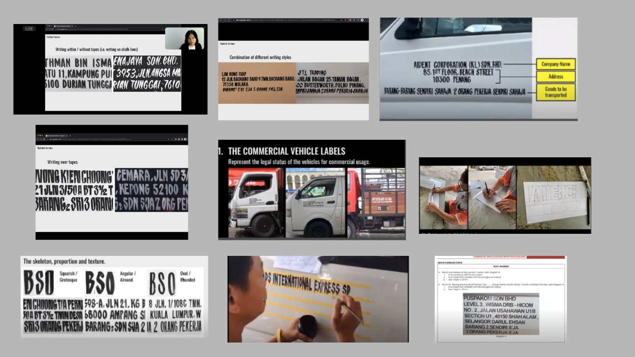
Fig 1.3 Week 9 Sharing session with Ms. Low Hsin Yin
Typeface construction refinement week
Week 10, 6/06/2023
This week, Mr. Vinod decided to make a patrol by pointing out the flaw in our digitization typefaces and giving us feedbacks while continuously to perfect our typefaces. It was also considered as a consultation week as we worked independently as the process to achieve the balance structure of the font is quite time-consuming and challenging.
Punctuation practice and Discussion
Week 11, 13/05/2023
On week 11, Mr. Vinod had given us feedback on our further improved typefaces and punctuations which are comma, full stop, exclamation mark and hashtag. We were advised to study further and make research the construction of these punctuations in order to make sure they are aligned to our design typefaces. He also had given us a short tutorial on how to improve them and teaching us how to use the FontLab for the process of kerning and to ensure we have no difficulties against it.
Instructions
Page 11-12: Task 3: Type Design and Communication
Following the instruction, we were given a chance to design our very own typeface with our handwritten sketch as our first guideline. This is to ensure that this is the traditional way of writing alphabets and making typefaces from old to modern.
__
1. Handwriting Sketches
-Write or sketch different angles of lines such as horizontal, vertical, diagonal and circular lines for each chosen 5 tools with 5 in different ways as well as the alphabet of (A, O, T, M, X ).
- Select 1 stroke from each 5 tool and further our writing practice using alphabets. (A, E, T, K, G, R, I, Y, M, P, N). We were given options whether to choose lowercase or uppercase.
Fig 2.1 Exercise instructions, (16/05/2023)

Phase 1: Practice on lines and alphabets (A, O, T, M, X)

Fig 2.3 Practice on lines and alphabets (A, O, T, M, X), (18/05/2023)
Then, I started working on my lines and alphabets with 5 different strokes for each 5 tools. I circled the stroke numbers as my chosen ones for the next step.
Phase 2: Handwriting on AETKGRIYMPN
After understanding the basics of angles and strokes, I began practicing on the given alphabets AETKGRIYMPN with my chosen strokes from each tool.

Phase 3: Finalized tool and handwriting


Fig. 2.6 My chosen proportionate alphabet
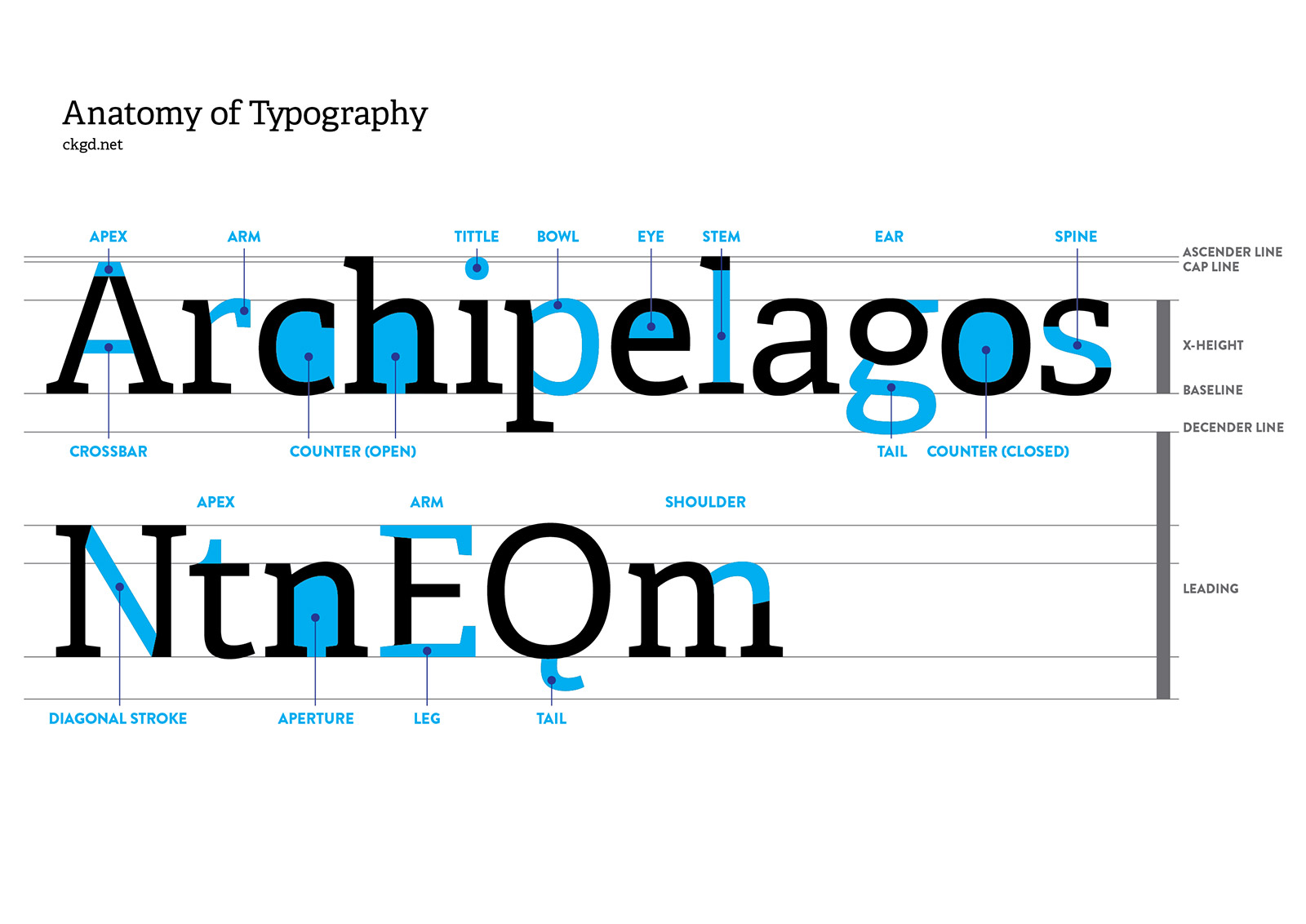
Fig. 3.1 Anatomy of typefaces
We must be aware of the typographic standards such as the baseline, median, ascender, descender, and typography essentials when designing a typeface.
Baseline: The imaginary line the visual base of the letterforms


Fig 3.3 Visual references on typefaces

Fig. 3.4 Typography Basic Books Part 1


3. Digitization construction of typeface
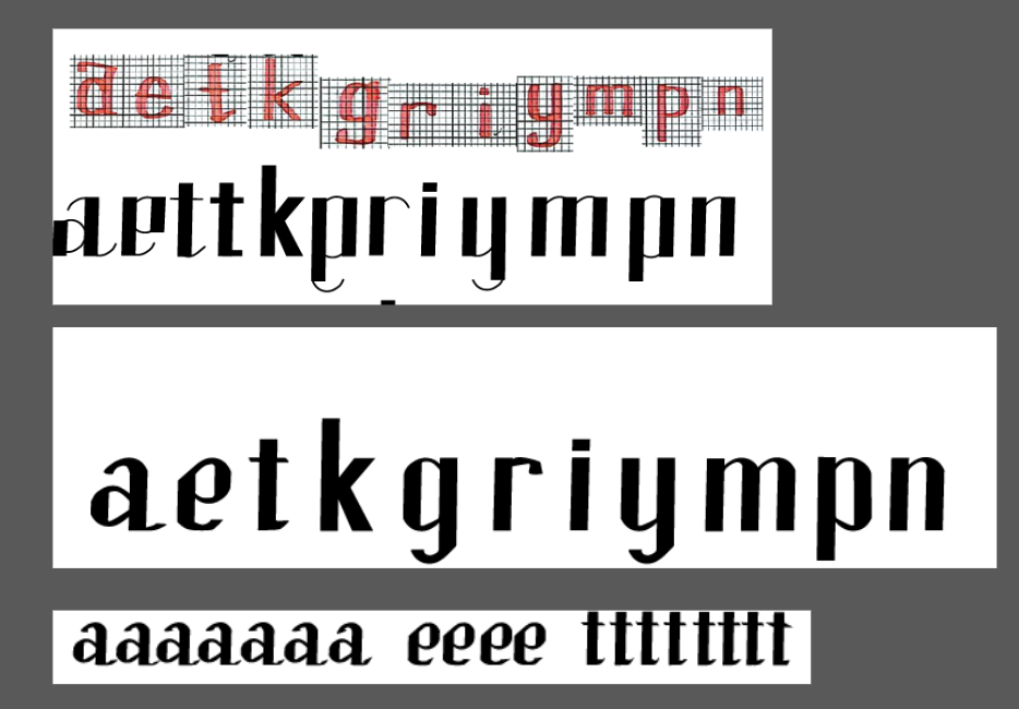

Fig 4.2 Handwriting to digitization, (05/06/2023)
With a few more practice, I was satisfied with the structure of this typeface and thus I continued to further refined it as my next step.
Tool used:
1) Pen tool
2) Eclipse tool
3) Calligraphy brush tool
4) Rectangle tool


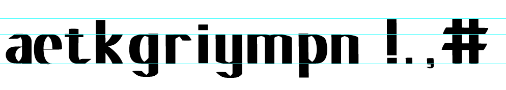
Fig. 5.2 Refined Digitalized letters (1), (07/06/2023)
Refined Digitalized letters (2):

Fig. 5.3 Refined Digitalized letters (2), (07/06/2023)
Refined Digitalized letters (3):

Fig. 5.4 Refined Digitalized letters (3), (07/06/2023)
Refined Digitalized letters (4):

Fig. 5.5 Refined Digitalized letters (4), (07/06/2023)
Finalized Digitalized letters (5):

Fig. 5.6 Final Digitalized Letters, (07/06/2023)
Based on these refines, I decided to make some changes to the punctuations at the same time such as hashtag and comma. Based on Mr. Vinod's feedback, the comma's downward stroke is too thin and the top appears to be too big. The hashtag would look more idealistic if it was slightly tilted rather than upright.
Punctuation's refinement:

Fig 5.7 Hashtag refinement, (09/06/2023)

Fig 5.8 Exclamation mark refinement, (09/06/2023)

Fig. 5.9 Comma mark refinement, (09/06/2023)
Fig 5.10 Details on Ascender, Descender, X-height, Baseline, (09/06/2023)
5. Fontlab
We are required to transfer our typeface into fontlab for trial and error to see if they are legible.
__

Fig. 6.1 Tutorial Video from Mr. Vinod, (15/06/2023)

Once I had transfer all my letters into Fontlab, I began the process of kerning for each individual glyphs in the metrics tab. In addition, I included the necessary font information and measurements such as ascender and descender height.
Measurements
Ascender height: 723
Cap Height: 583
Median line: 500
Baseline: 0
Descender line: -211


6. Poster layout and Sentence
Based on Mr. Vinod's feedback, we are required to use all of the letters provided in our poster. After multiple ways of thinking, I ended up with a sentence "typing make me king, pain ignite my game! #rip ".
___

Fig. 7.1 my poster layouts, (23/06/2023)

I decided to choose layout #7 as my final poster. I decided to make a few adjustments with the kerning and spacing so that it did not look awkward or out of the place.
7. Final outcome of typeface
Font download link: Rihanna

Fig. 8.3 Final Task 3: Type Design and Communication " Rihanna" in PDF, (24/06/2023)
Feedback
Week 12:
General Feedback: Ensure that the credit name is at 12 point. Make sure the watermarks are Helvetica or Univers.
Specific Feedback: The comma strokes are too thin and the top part is too big
Week 11:
General Feedback: The vertical strokes of each letter needs to be the same. Particularly to hashtags, they should be in capital height. Hashtags look better when they are diagonal. The strokes needs to be consistent in the thickness before refining them. The watermarks must either use Helvetica or universe in point size 12 with 2.5-3.6 ledding. The poster is needed to be in A4 size as final.
Week 10:
General Feedback: Make sure that the digitization process is not the exact copy with the sketches. Try to refine the lines and angle to make it font-like and do some research to gain some inspiration.
Specific Feedback: The process seems a little complicated and slightly wrong. Try to make it easier by using the proper tools.
Week 9:
General Feedback: Start the digitization of each letter from your calligraphy sketches.
Specific Feedback: Your first attempt at digitization is quite questionable. Try to watch the lecture videos.
Week 8: ILW
Week 7:
General Feedback: For task 3, make sure the strokes are not changed to a different angle when doing calligraphy. If the tip of the brush is too thick, it is advised to use two unit boxes to create more space. Do not put in too much pressure on your strokes as it could damage the brush.
Reflection
Experience: My whole reaction to this assignment was awestruck as this is something I have never done before. However, it was very enjoyable how it all started from calligraphy to digitization from one step to another. I had a few challenges when it came to digitization. Despite that, with proper guidance I was able to surpass that obstacle and be able to come out with my very own typeface which is something that I never thought of. Using Fontlab for the first time was quite intriguing but I realized that kerning was something that I was trained for from my previous assignment. I was also glad to listen to an expert about their experiences and certain challenges that they had to went through. It was very inspirational by allowing to continue till the end of this assignment.
Observations: Based on my observation, creating a typeface takes a lot of intricate details and consider very time-consuming. Each element within a letter's design must adhere to typographic basics and knowledge. I observed other student's work and each one of them have a lot of great ideas. One of them literally make a typeface came out of Romania. However, there are numerous times where I thought that I may have chosen the wrong typeface for this project. But resilience is the key and I continued to perfect them.
Findings: I believe that creating each strokes for each letters have their own challenges. Some of them can be rounded on the edges or even squared. It is something that we have to particularly focus on and not miss any important minor details. It makes me wonder how many years would it take for a person to create these typefaces without any technology in the old eras. Punctuations can be a little bit tricky if it is not followed according to the anatomy of typography.
Further reading

Fig. 9.1 A type primer by John Kane
Fig. 9.2 Describing letterforms

Fig. 9.3 Typographic Basics Book
Fig. 9.4 Importance of kerning
These notes give specific explanations about the importance of kerning based on their values. It is important to keep track whether you have exceed or too little kerning in your words.
Fig. 9.5 Font family and font style
A few explanations and examples are shown about the different types of font family and font style. A definition is also included for a clearer explanation.
Type me! It can be really fun. #Super cool
letters provided: aetkgriympn in lowercase
Comments
Post a Comment