Digital Photography & Imaging - Project 3
6/4/2023 - 6/7/2023: (Week 1- Week 14)
Ameera Rihana binti Remy Ansara / 0352511 / Group 3
Digital Photography & Imaging / Bachelor of Designs (hons) in Creative Media
Project 3: Portfolio
LECTURES
Week 1: Subject outline & Expectations
Mr. Mohd Fauzi gave a brief introduction lecture on digital photography & imaging, where he discussed about the importance uses of Photoshop and the learning outcomes we would achieve in this module. Other than that, he also demonstrated a few examples of his student's amazing work that had been created in Photoshop. These few examples explained about the new terms that we were going to learn in this software such as manipulation, restoration, digital imaging, color correction and other features that are commonly used in digital photography and imaging. He assigned us our first task which involves collaging and montaging pictures. We were also briefed about the assignment.
Week 2: Intro to Composition
1. Intro to basic composition
- Focal point: A key element to any good composition is a strong focal point, as it helps your viewer's eyes naturally settle on the important pieces of your design first.
- Scale and hierarchy: Scale is often used to help communicate hierarchy by drawing attention towards and away from certain elements, thus signifying their importance to the communication.
- Balance the elements: A good technique for mastering asymmetrical balance is to think of each element as having a 'weight' to it. Smaller object might 'weigh' less than larger objects, and heavily textured elements 'weigh' more than flatly colored elements.
- White space: known as 'empty space' to balance up the main focus of a composition. It is used strategically which help boost your design's clarity and overall look by balancing out the more complicated and busy parts of your composition with space that helps your design to breath.
2. Rules of Thirds

Fig 1.1 Rule of Thirds
Fig 1.1 Rule of Thirds
Rule of Thirds is the process of dividing an image into thirds, using two horizontal and two vertical lines. This imaginary grid yields nine parts with four intersection points. By positioning your elements at these intersection points, it produces a much more natural image. It is often suggested that any horizon is placed on either the top horizontal or the bottom horizontal line.

Fig 1.2 Example of Applying Rule of Third
Fig 1.2 Example of Applying Rule of Third
3. Golden Ratio

Fig 1.3 Golden Ratio
Fig 1.5 Shot Framing The Ultimate Guide
Fig 1.3 Golden Ratio
- The Golden Ratio is a mathematical ratio. It is commonly found in nature, and when used in design, it fosters organic and natural-looking compositions that are aesthetically pleasing to the eye.
- Golden Ratio boils down to aesthetics, creating and appreciating a sense of beauty through harmony and proportion. It provides a sense of artistry.
- It is a useful guideline for determining dimensions of the layout. One very simple way is to set your dimensions to 1:1.618.
Fig 1.5 Shot Framing The Ultimate Guide
YouTube Link: https://www.youtube.com/watch?v=qQNiqzuXjoM
Week 3: Intro to Photoshop 2
1. Lasso Tool
2. Pen Tool
Fig 2.5 How to use a Pen Tool
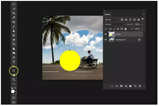
Fig 2.6 Layering in Photoshop
Fig 2.7 How to open images as layers in Photoshop
YouTube link: https://youtu.be/0dOvqYO5nfg
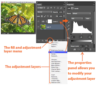
Fig 3.1 Adjustment Layers and Filters
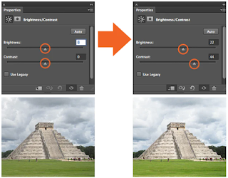
Fig 3.2 Adjusting brightness and contrast
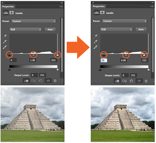
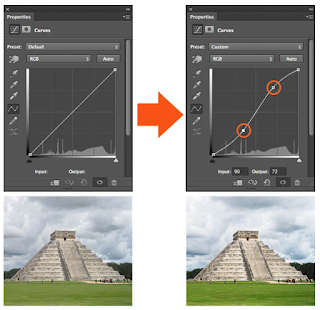
Fig 3.4 Adjusting Curves
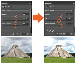
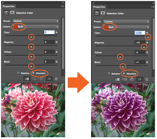
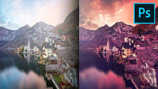
Fig 3.6 Adjustment filters
Fig 3.7 Photo filter trick in Photoshop
Week 5: Digital Photography

Fig 4.1 Exposure Triangle

Fig 4.2 Iris


Fig 4.6 Depth of field

2. Balance and Alignment

Fig 5.2 Balance and Alignment


What is Double Exposure Photography?


Fig 6.2 Fake Reflection

Many double exposure photographers work with silhouettes. But what if you work with silhouettes only? It would give you a fun and doable challenge. And an opportunity to show very creative sides of yourself.


Fig 7.1 Digital surrealism


Fig 9.2 Compositing Layers in After Effects
Fig 10.1 Composition Studies: Collaging
Fig 10.3 How to Remove background using Pen Tool
Fig 10.5 Fix Skin Tones in Photoshop
YouTube Link: https://www.youtube.com/watch?v=D2brHNadF8Y
Fig 10.7 Photographic Basics
YouTube Link: https://www.youtube.com/watch?v=AKXwJbZ7kXQ
Fig 10.10 Create Loop animation for i.g. stories
YouTube Link: https://www.youtube.com/watch?v=HQL5ntLlHTg
PRACTICAL
This week, we had a workshop and had a collage session with another group. We cut and compose our own collage with the lecturer's feedback.
Fig 13.2 Photo Filters
Week 6: Recoloring Black and White
Week 7: Double Exposure
Firstly, I imported the file that was provided. Then, I begin animating each of the elements given by adding new keyframes. These keyframes include rotation, position and scales. I also tried to explore with the masking path by adding it at then end of the video.
Additionally, to make it more the effects more desirable, I tried to add some sound effects to the video by figuring out watching tutorials in YouTube.
Fig. 17.4 Final After Effect Exercise - Week 10

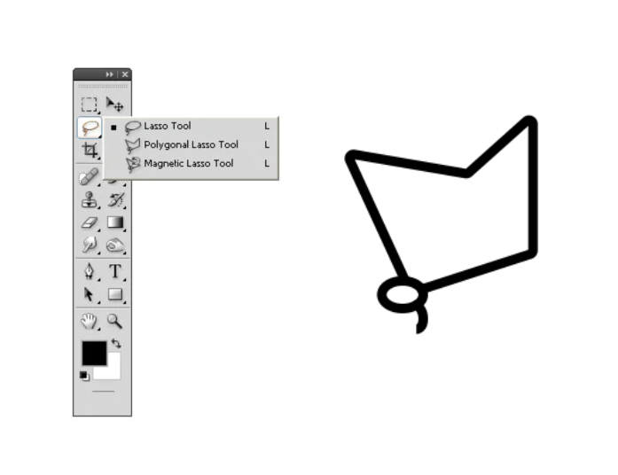
Fig 2.1 Lasso Tool
- Lasso Tool allows you to draw and pinpoint specific areas of the document in Photoshop.
- There are three different versions of Lasso Tool: Lasso, Polygonal, Magnetic Lasso
- It is great to use with a graphic tablet because it is similar to a pencil. It can give a better flow when drawing and making selections.
Fig 2.2 Tutorial Basics on using Lasso Tool
YouTube Link: https://www.youtube.com/watch?v=DKtHsFaclKo
2. Pen Tool
- When creating a path from scratch, the pen tool is the most common option.
- To use a Pen Tool, select from the toolbar and click on the starting point of the path.
- Click again to create a second point, and a straight line will appear between the two points.
- To create a curve line, click and drag the Pen Tool to adjust the curve of the line.
- The more points you add to the path, the more detailed and complex it will be. However, it will become more difficult to edit.
- To create a closed path, click on the starting point with the Pen Tool, and the path will close instantly.
Fig 2.5 How to use a Pen Tool
3. Layering
Fig 2.6 Layering in Photoshop
- Layers are different images stack on top of each other.
- You can use each layer without affecting another one to make adjustments.
- You can use layers for non-destructive editing.
- The adjustments in Photoshop will never destroy the original image.
- The layers panel in Photoshop allows for easy organization and manipulation of layers.
- Understanding layers is essential for advanced photo editing and graphic design in Photoshop.
- Practice layers can improve Photoshop skills and allow for more creative freedom in projects.
Fig 2.7 How to open images as layers in Photoshop
YouTube link: https://youtu.be/0dOvqYO5nfg
Week 4: Intro to Photoshop 3
1. Adjustment Layers and Filters
Fig 3.1 Adjustment Layers and Filters
Adjustment layers are non-destructive image editing tools that add color and tonal adjustments to your image without permanently changing its pixels. You can edit and discard your adjustments or restore your original image at anytime which allows efficiency and flexibility. When an adjustment layer is added to an image, a new layer will appear over the image and a Properties panel specific to the type of adjustment you've selected will pop up, allowing you to modify your adjustment layer, which will modify the image.
Brightness & Contrast
Fig 3.2 Adjusting brightness and contrast
The Brightness / Contrast makes adjustments to the tonal range of your image, allowing for adjusting the highlights in your image and the Contrast slider is for adjusting the shadows in your image.
Level
Fig 3.3 Adjusting Levels
Levels modify the tonal values in an image by adjusting the levels of the shadows, mid tones and highlights.
Curves
Fig 3.4 Adjusting Curves
Curves lets you adjust as many points as you want throughout the entire tonal range of your image, and is the most powerful and precise tool for editing the tones in an image.
Exposure
Fig 3.5 Adjusting Exposure
Exposures lets you adjust exposure levels with three sliders: Exposure, Offset and Gamma. Exposure will adjust only the highlights of the image, Offset adjusts the mid tones and Gamma will adjust the dark tones only.
Selective Color
Fig 3.5 Adjusting selective color
The Selective Color adjustment layer selectively modifies the amount of a primary color without modifying the other primary colors in your image.
2. Filters
Fig 3.6 Adjustment filters
Using filters to edit photos is an essential element of Adobe's graphics editor. There are filters to change color, add blur or create completely new image effects. Photoshop offers a virtually unlimited variety of filters for this purpose.
Fig 3.7 Photo filter trick in Photoshop
Week 5: Digital Photography
1. Exposure Setting
The main parts of the camera:
- Camera body: Shutter, image sensor, LCD screen
- Camera lens: Aperture / Iris
The camera body is a light proof box.
Fig 4.1 Exposure Triangle
There are only two camera settings that affect the actual "luminous exposure' of an image: shutter speed and aperture. The third setting, camera ISO, also affects the brightness of your photos.
Fig 4.2 Iris
Iris
- Iris / Aperture is control the flow of light entering the lens.
- Iris is measured by f-stop, indicated by sequence of f-number: f/1, f/1.4, f/2, f/2.8, f/4, f/5.6, f/8, f/11, f/16, f/22, f/32..
- The lower the f-number, the larger the lens opening.
Fig 4.3 Shutter speed
Shutter
- Shutter is a small plastic sheet that opens and closes to allow light onto the film or prevent light from reaching the film.
- Shutter speed is measured in seconds: 1/1000s, 1/500s, 1/250s, 1/125s, 1/60s, 1/30s, 1/15s, 1/8s, 1/4s, 1/2s, 1s, 2s, 3s ...
Fig 4.4 ISO
ISO
- Originally referred to the sensitivity of film - its 'light gathering' ability. For digital photography, ISO refers to the sensitivity - the signal gain - of the camera's sensor.
- The ISO camera settings are: 100, 200, 400, 640, 800, 1600, 3200, 6400...
- The lower the number of ISO the less sensitive your camera is to light and and the finer the grain.
2. Lens Perspective
Fig 4.5 Focal Length
Focal Length
- Focal length is the measurement (in millimeters) from the optical center of a camera lens to the camera's sensor.
- The shorter the focal length, the wider the angle of view and vice-versa.
Fig 4.6 Depth of field
Depth of field
- The proportion of the image that is reasonably sharp and in focus.
- The smaller the aperture you use, the greater the depth of field.
Wide angle lens is especially useful for landscape photography or street photography. With wide angle lenses, almost everything is in focus, unless your subject is very close to the lens.
3. DSLR VS SMARTPHONE
PRO
- Familiar with device
- Good quality
- Easy to learn
CON
- Still limited
- Good but not great
- Non-ergonomic shape
Smartphones vs Cameras = Convenience vs Quality
DSLR cameras are designed to capture images. Phones are designs to carry out a multitude of functions. Due to their size, phone cameras are limited in terms of the size of the lens and sensor that are used to capture photos. In contrast, DSLR have larger lenses and sensors than mobile phones do.
Week 6: Poster Design
The fundamental principles of design are: Emphasis, Balance and Alignment, Contrast, Repetition, Proportion, Movement and White Space.
1.Emphasis
Fig 5.1 Emphasis
Emphasis is the part of the design that catches the viewer's attention. It will make one area stand out by contrasting it with other areas.
2. Balance and Alignment
Fig 5.2 Balance and Alignment
It refers to the distribution of visual weight in a composition, aiming for stability and harmony.
3. Contrast
Fig 5.3 Contrast
Contrast is what people mean when they say a design "pops". It comes away from the page and sticks in your memory. It creates space and difference between elements in your design. The background needs to be significantly different from the color of your elements so they work harmoniously together and readable.
4.Repetition
Limiting yourself to two strong typefaces or three strong colors, you'll soon find you'll have to repeat some things. It often unifies and strengthens a design. For example, using blue italic sans-serif in your poster, it can read like an error. If three things are in blue italic sans-serif, you've created a motif and are back in control of your design.
5. Proportion
Proportion is the visual size and weight of elements in a composition and how they relate to each other. It often helps to approach your design in sections, instead of a whole.
6. Movement
Movement is controlling the elements in a composition so that the eye is led to move from one to the next and the information is properly communicated to your audience. Movement creates the story or the narrative of your work.
7. White Space
Fig 5.4 White Space
White space (negative space) is the only one that specifically deals with what you don't add. White space is exactly that - the empty page around the elements in your composition. It can be a perilous zone but it often simply giving a composition more room to breathe which can upgrade it from mediocre to successful.
Fig 5.5 The 7 Design Principles of Design
YouTube Link: https://youtu.be/qp3jHWyPW-E
Week 7: Double Exposure
What is Double Exposure Photography?
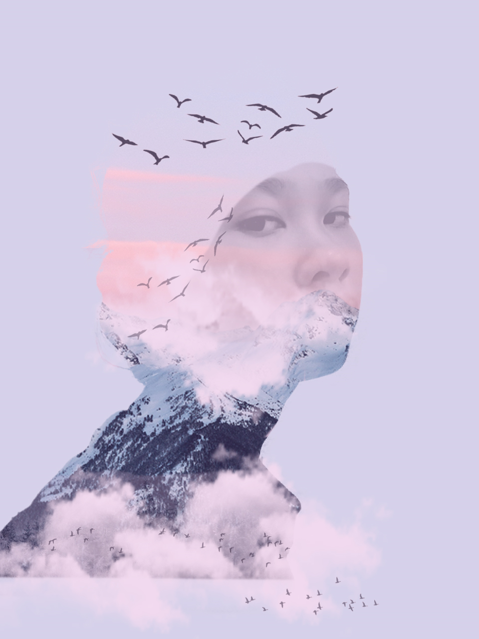
- Double exposure photography refers to merging multiple images. The goal is to make them surreal, emotional or humorous. They usually feature silhouettes.
- Double exposure effect may look complicated at first. But it is easy to make in-camera and in Adobe Photoshop. You don't need a double exposure camera, as there are a few other ways you can create them.
1. Using the Tilt-Shift Effect
Fig 6.1 Tilt-shift Effect
If you want to be extra creative, blur one of your photos instead of the entire image. Or blur everything except for one important detail.
To add this feature, go to Filter > Blur Gallery > Tilt-Shift.
2. Create Fake Reflection
Fig 6.2 Fake Reflection
- There are many ways you can create reflections. One of them is creating a double exposure with the help of a separate window photo.
- This is an example of main subject surface with raindrops and bokeh. This help to add interesting textures to a multiple exposure photography.
3. Experiment with simple portraits and detailed textured
Combining something plain with something complicated will give you a balanced result. It will also save a lot of simples photos that you might discard.
4. Convert your result to black and white
- A lack of color will strengthen your emotions in your double exposure images. If you want to express your work in a vulnerable way, experiment with this.
- It gives them a unique depth and allows you to experiment with something interesting just like film photography.
5. Work with silhouette
Fig 6.3 Silhouette
Many double exposure photographers work with silhouettes. But what if you work with silhouettes only? It would give you a fun and doable challenge. And an opportunity to show very creative sides of yourself.
6. Pick two random photo
A lot of double exposures photography were happy accidents. But they lead to great feedback and even greater creative growth. Try and forget about any other double exposure ideas. Shoot interesting textures, shapes and forms instead.
7. Make simple objects look fascinating
Take photos everyday objects you usually take for granted. Try to make them look like something else.
8. Use Shadow
Fig 6.4 Shadow effect
Outlines of any kind are fantastic to work with for double exposure photography. Shadows are as effective as silhouettes in this genre. Take a photo of someone's shadow and transform it into a story. You can do anything your heart desires with outlines of this sort. All you have to do is go out, take photos of a few shadows, and turn them into something beautiful.
Blend Mode
Here's a quick guide:
1. Select the Layer 1 (Fire) to be on top of the background (Musicians)
2. Go to Blending Modes option
3. Select "Screen"
4. As a result, all of the pixels on the fire will be selected as Screen blending mode.
Week 9: Digital Surrealism
Realism vs Surrealism
Realism vs Surrealism
Realism:
- Focuses on ordinary and common subject matters of the real world
- Portrays non-exotic and non-extraordinary subject matter and theme
- There is no need to think outside of the box, as that is not 'real'.
Surrealism:
- Explores the subconscious minds, with subject matters concentrating on dream-images.
- Aims to distort the ordinary and what we call reality
- Challenges traditional perceptions and embrace the extraordinary.
- Explores the depth of imagination and subconscious.
- Encourage thinking outside the box and breaking free from conventional constraints.
What is digital surrealism?
Surrealism is a cultural movement focused on types of arts to express about the artist's idea themselves. In this digital era surrealism is one of the top digital art styles.
Fig 7.1 Digital surrealism
How to start creating surrealism?
- Dream like scenes and symbolic images.
- Unexpected, illogical juxtapositions
- Bizarre assemblages of ordinary objects
- Primitive or child-like designs
Capturing your dream
1. Sketch it out
Take a piece of paper and pen / pencil or a tablet and start a sketch. Draw your vision out roughly. Don't finesse any details yet, but just lay out key points of your vision.
2. Find reference images
Gathering reference images will help you greatly in realizing your new idea. GAther images that directly relate to what you have in mind.
Mindset During Creation
1. Does this look real?
Surrealism is at its best when it's convincing enough that it could be real, however we obviously know that the subject matter you are creating is nonexistent, thus it is not real.
2. Make it happen to the best of your ability.
When you try to approach something challenging, you will learn the skills you may need for the next time to make it work. The worst thing you can do is be afraid and back off from your idea, because you would never learn that way.
Week 10: Intro to After Effects
1.What is After Effects?
Adobe After Effects is a 2.5D animation software used for animation, visual effects, and motion picture compositing. It is used in film, TV, and web video creation. This software is used in post-production phase and has hundreds of effects that can be used to manipulate imagery. This allows you to combine layers of video and images into the same scene.
2. Compositing Layers in Photoshop
Fig 9.1 Compositing Layers in Photoshop
- Photoshop is a platform for compositing layers.
- All the layers need to be arranged and rename accordingly so that it will be organize and easy to be animated in After Effects.
3. Compositing Layers in After Effects
Fig 9.2 Compositing Layers in After Effects
- Adobe After Effects is a digital visual effects, motion graphics, and compositing application.
- All the layer elements need to be organized and synchronized to the external software platforms such as Photoshop & Illustrator.
- After Effects files does not embed its media, it links to it.
TUTORIALS
1. Week 1 and 2: Composition Studies
Fig 10.1 Composition Studies: Collaging
YouTube Link: https://www.youtube.com/watch?v=2KqXGMf0HNk
2. Week 3: Paths, Masking, Layering
3. Week 4: Vital Tools & Project 1
Fig 10.3 How to Remove background using Pen Tool
YouTube Link: https://www.youtube.com/watch?v=4b-swzGzOGw
Fig 10.4 Apply Adjustment to single layer
YouTube Link: https://www.youtube.com/watch?v=81lAetwbAUs
Fig 10.5 Fix Skin Tones in Photoshop
YouTube Link: https://www.youtube.com/watch?v=D2brHNadF8Y
4. Week 5: Studio Shooting
Fig 10.6 DIY Photography studio at home
YouTube Link: https://www.youtube.com/watch?v=JiVVWiqTnQc
5. Week 7: Photographic Basic
Fig 10.7 Photographic Basics
YouTube Link: https://youtu.be/V7z7BAZdt2M
Fig 10.8 Creative Product Photographic at home
YouTube Link: https://www.youtube.com/watch?v=ffiJH5fUeN0
Fig 10.9 Shooting a bottle with one continuous light and smartphone
YouTube Link: https://www.youtube.com/watch?v=AKXwJbZ7kXQ
6. Week 9: Moving Imagery
Fig 10.10 Create Loop animation for i.g. stories
YouTube Link: https://www.youtube.com/watch?v=HQL5ntLlHTg
7. Week 10: Interface, Layers and Tools
PRACTICAL
Week 1: Creating E-Portfolio
Pinterest Board: https://www.pinterest.com/ameeraremy/dpimeewa/
List down your three favorite graphic design composition work from Pinterest. Explain in your E-portfolio and why do you like the designs.
Design #1:
Week 3: The Bezier Game
Fig 13.2 Photo Filters
After the tutorial from Mr. Fauzi's class, we added our own adjustment layers to our own digital collage as the final procedure.
Week 5: Photo Manipulation
Week 6: Recoloring Black and White
Week 10: After Effect Exercise
1. Download the PSD composition below:
https://drive.google.com/file/d/197rXGH_g-lLEt-0K9__mcKrLIYIaXtQp/view?usp=sharing
1. Download the PSD composition below:
https://drive.google.com/file/d/197rXGH_g-lLEt-0K9__mcKrLIYIaXtQp/view?usp=sharing
2. Import the W10 ANIMATE.psd into Adobe After Effects
3. Create a composition setting 1080 px (Width) x 1920 px (Height), Duration 15 second.
4.Create a keyframe animation to the layers using Position (P), Scale(S) & Masking Path.
5. Render Output: Quicktime (MOV) or .MP4
6.Upload your exercise to YouTube Channel .
7. Update your progress and video to your E-Portfolio Blog.
8. Attach your E-Portfolio link to this submission.
Firstly, I imported the file that was provided. Then, I begin animating each of the elements given by adding new keyframes. These keyframes include rotation, position and scales. I also tried to explore with the masking path by adding it at then end of the video.
Additionally, to make it more the effects more desirable, I tried to add some sound effects to the video by figuring out watching tutorials in YouTube.
Fig. 17.4 Final After Effect Exercise - Week 10
REFLECTION
By looking back through these exercises, I realized that I have gathered so many knowledge about digital photography and imaging in merely just a few months. The process of learning all kinds of tools have been an amazing experience. Not only have I grown out from being a beginner, I have also grown to become a better person throughout this journey. From the basics of photography to animating photos, each path has been very beneficial which becomes a tool to refining my skills and broadening my creative abilities.






Comments
Post a Comment