Information Design - EXERCISES

INSTRUCTIONS
LECTURES
Week 1
Throughout this week, we had a brief discussion about the module itself and started with a few exercises to get a further scope on the topic.
Afterwards, we divided ourselves into different groups in order to settle our FLIP session for the upcoming future. We started off with our first topic:
Different type of infographics & online tools
This week, we started off with our lecture by presenting the types of infographics tasked by our lecturers accordingly to our respective groups. We created a presentation slide to explain the characteristics, the meaning behind it, the examples and the importance of each infographics that was stated based on our extensive research.
Based on our feedback, presentation wise still needs a bit more of work but our examples for each infographic is spot on and accurate.
In the third week, we started presenting FLIP topic 2 (LATCH). Then, we proceed with our next FLIP topic called Miller's Law (Chunking). At the same time, we discussed the starting of our project 1 based on our chosen video on a YouTube Channel called "Pasta's Grannies". Our presentation went on a hit by taking notes on our previous mistakes.
EXERCISES
Week 1
Exercise 1: Quantify and Visualize Data
Quantify Objects
Quantify (count) chosen items and arrange the objects into a presentable layout or chart. Take a picture and submit!
Keep it simple, present the information as clear as possible and as interesting as possible. Aesthetic is the key but so does information delivery!
Requirements Information must be presented as is. You are required to arrange the objects with relevant indicators written out with pens to help you visualize the quantity and data. Take a picture of the final assembly and upload into your E-portfolio and Google Classroom.
__
1) Progression Visualizing
Brainstorming:
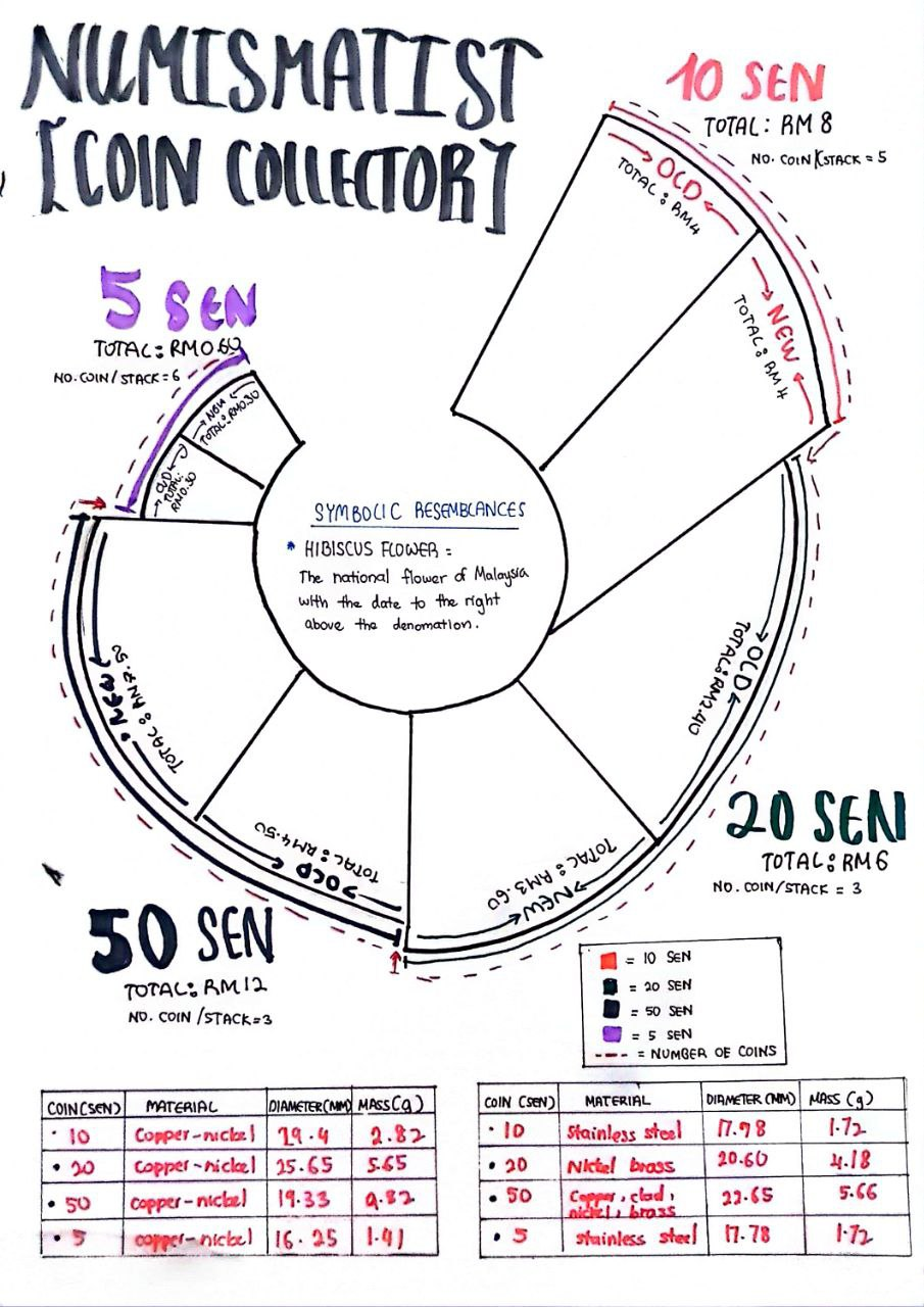
In order to fully visualize and capture the bigger picture, we tested ourselves with different arrangements of our chosen object to create our desired data based on the acquired information and creativity. My desired object for this exercise will be coins. Firstly, I tested out the arrangements and took a few pictures for extra references and potential layouts.

Fig 0.1 Attempted arrangement (coins)
Visual Reference:
To gather more inspirational ideas, I began to observe and collect visual references that have similarities and potential clues to set up my own data by emphasizing on the information and the visualization.
Fig 0.2 Visual Reference
Data Planning:

Fig 0.3 Data Planning

Fig 0.4 Updated Data


Tutorial:
Organize a group of information into a visual poster that combines and utilizes the LATCH principles (Minimum 4)
These are a few of the suggested compiled data you can use or, you can pick any topic you want:
- Pokedex
- FFX1V Bestiary
- Dinosaur
Use the digital photo editing/illustration software available to assemble the Pokemon into a LATCH infographic poster. You can re-use back the images of the monsters but do create the rest of your visuals to complete the poster.
Reminder:
Location / Alphabet / Time / Category / Hierarchy
Organize a group of information into a visual poster that combines and utilizes the LATCH principles (minimum 4)
Requirements: Size resolution: 1240 × 1750 pixels or 2048 × 2048 pixels
Use the digital photo editing/illustration software available to assemble the Pokemon into a LATCH infographic poster. You can re-use back the images of the monsters but do create the rest of your visuals to complete the poster.
Data Gathering:
To create an infographic poster based on the L.A.T.C.H principle, we are free to pick any topic we desire out of the suggested topics or think outside the box. My chosen topic for this exercise will be about Pokedex. By scrolling through many websites on the internet, I gathered some potential data and arranged them in specific categories by keeping the L.A.T.C.H principle in mind.

Fig 1.0 Data Gathering
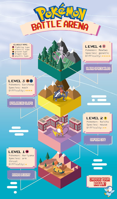
I organized my information into three different groups which are A Group of Pokemon's Generation, Type of Rarity in Pokemon and Battle Arena Pokemon.

Fig 1.01 Inspo mood board

Since I was inexperience designing my poster in isometric form, I decided to look up for tutorial videos on YouTube to discover simple tricks and techniques.
Fig 1.03 Skills for isometric design
Fig 1.04 3D Floating Island

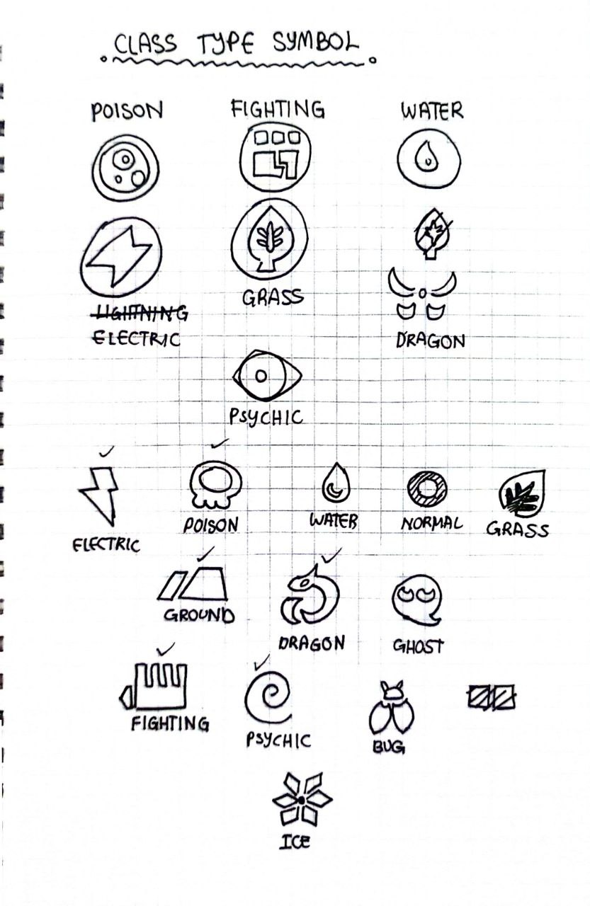

Fig 1.3 Class type symbols

Fig 1.4 Color palette
b) Isometric layout:
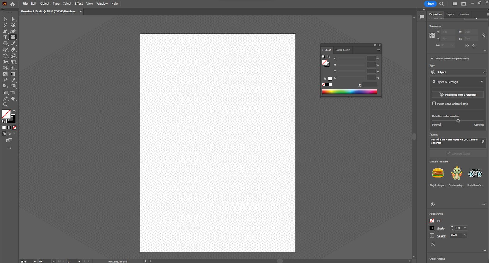
Fig. 1.5 Rectangle grid tool
Firstly, I started planning out the measurement by using a rectangle grid tool, using the transform tool from the window's panel to get a desirable angle.
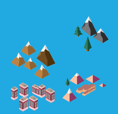
Fig. 1.61 Isometric illustration #1

Fig. 1.62 Isometric illustration #2

Fig. 1.63 Isometric illustration #3
Therefore, I began digitalizing my isometric blocks follow accordingly to the grids for each Pokemon's location based on the information and the sketches. I added different colors and elements to represent different regions.

Fig 1.7 #1 Layout Progression
Moving on, I began placing down a pokemon in each block and designing the infographic by using speech bubbles to insert the characteristics or information for each pokemon.

Fig 1.7 #2 Layout Progression


To make some final adjustments, I added some minor decorative elements and missed information to form the complete infographic poster.

Fig 1.8 Final Poster JPEG (Pokemon Battle Arena)
General Feedback: Keep design principles in mind when arranging the objects (exercise 01). Think of how the chart will be visually presented to the viewers.
Week 2:
General Feedback: Mr. Shamsul suggested we should focus more on elaborating the relationship between the topic and the examples. Make sure to develop the idea from sketches. Keep in mind the given time of each exercise is 1 week, keep things simple but make sure the information is there.
Observation: Through my observation, infographics allows for visual story telling, where complex information is presented in a visually appealing and easy-to-understand manner. This includes noting areas where the infographic may be unclear or where additional information is needed to enhance understanding.
Findings: Sketching out ideas and planning beforehand gives better results compared to jumping straight to the point. Regarding to collecting data, making a slight mistake could effect the infographic as a whole.
Comments
Post a Comment