Advanced Typography - Task 1 (Exercises)

24/4/2024 - 15/4/2024
Ameera Rihana binti Remy Ansara
Advanced Typography / Bachelor of (hons) in Creative Media
Exercise 1 & 2
LECTURES
Week 1 - Lecture 1
Advanced typography: Typographic Systems
Advanced typography: Typographic Systems
Typography systems provide a sense of purpose that focuses and directs the decision-making.
Shape grammar is a set of shape rules that apply in a step-by-step way to generate a set, or language, of designs.

Fig 1.1 Axial System
Axial system: All elements are organized to the left or the right of a single axis.

Fig 1.2 Radial System
Radial system: All elements are extended from a point of focus.

Fig 1.3 Dilatational System
Dilatational System: All elements are expand from a central point in a circular fashion.

Fig 1.4 Random system
Random system: Elements appear to have no specific pattern or relationship.

Fig. 1.5 Grid System
Grid System: A system of horizontal and vertical divisions.

Fig. 1.6 Transitional
Transitional System: An informal system of layered banding.

Fig. 1.7 Modular System
Modular system: A series of non-objective elements that are constructed as a standardized unit.

Fig. 1.8 Bilateral system
Bilateral system: All text is arranged symmetrically on a single axis.
Week 2 - Lecture 2
Advanced typography: Typographic Composition

Fig. 2.1 Principles of Design: Emphasis

Fig. 2.2 The Rule of Third
The Rule of Thirds: A photographic guide to composition. The intersecting lines are used as a guide to place the point of interest, within the given space.

Fig. 2.3 Environmental Grid, Typographic Form and Communication (2015)
Environmental Grid: Based on the exploration of an existing structure or numerous structures combined.

Fig. 2.4 Form and movement
Form and Movement: Based on the exploration of an existing Grid Systems. The placement of a form on a page, over many pages creates movement. The forms could represent images, text or color.
Week 3 - Lecture 3
Advanced typography: Context and Creativity
The first mechanically produced letterforms were designed to directly imitate handwriting. Handwriting would become the basis or standard for form, spacing and conventions mechanical type would try and mimic.

Fig. 3.1 Cuneiform c. 3000 B.C.E
The earliest system of actual writing, written from left to right and evolved from pictograms.

Fig. 3.2 Hieroglyphs
- To represent the things they actually depicted
- As determinatives to show that the signs preceding are meant as phonograms and to indicate the general idea of the word.
- As phonograms to represent sounds that "spell out" individual words.

Fig. 3.3 Letterforms through the ages
Early / Greek (5th C. B.C.E): Drawn freehand, not constructed with compasses and rules, and they had no serifs. In time the strokes of these letters grew thicker, the aperture lessened, and serifs appeared.
Roman Uncials: By the 4th century Roman letters were becoming more rounded, the curved form allowed for fewer strokes and could be written faster.
English Half Uncials (8th C.): In England, the uncial evolved into a more slanted and condensed form. While English and Irish uncials evolved, writing on the European continent devolved considerably and needed a reformer. Luckily, it came in the Carolingian Handwriting Reform.
Carolingian Minuscule: Capitals at the start of a sentence, spaces between words and punctuation. It was this style that became the pattern for the Humanistic writing of the fifteenth century; this latter, in turn, was the basis of our lower-case roman type.
Black Letter (12-15 C. CE): Characterized by tight spacing and condensed lettering. Evenly spaced verticals dominated the letterform. Condensing line spacing and letter spacing reduced the amount of costly materials in book production.
The Italian Renaissance: Newly rediscovered letterforms Antica. The renaissance analysis of form that was being applied to art and architecture was directed toward letterform — resulting in a more perfect or rationalized letter.

Fig. 3.4 ' Indian' subcontinent the Indus Valley Civilization (IVC) script (3500-2000 BCE)
The oldest writing found in the ‘Indian’ subcontinent the Indus Valley Civilization (IVC) script (3500-2000 BCE), is as yet undeciphered and seems to have been somewhat logo-syllabic in nature.

Fig. 3.5 Brahmi Script (450-350 BCE)
The earliest writing system developed in India after the Indus script. It is one of the most influential writing systems; all modern Indian scripts and several hundred scripts found in Southeast and East Asia are derived from Brahmi.

Fig. 3.6 Southeast Asia scripts, scripts of the communities that assimilated into Peninsula Malay communities.
Week 4 - Lecture 4
Advanced Typography: Designing Type
Type Design Process
1. Research

Fig. 4.1 Construction grid for roman capitals (8 x 8 cells)
Using grids (with circular forms) can facilitate the construction of letterforms and is a possible method to build / create / design your letterform.

Fig. 4.2 Classification according to form and construction
- Understand type history, type anatomy, type conventions and terminologies.
- Determine the type’s purpose or what it would be used for and what different applications it will be used in.
- Study existing fonts that are presently being used for inspiration / ideas / reference / context / usage pattern / etc.
2. Sketching: Traditional/digital
3. Digitization
Professional software: Font Lab and Glyphs App. Some designers also use Adobe Illustrator then only the specialized font apps. This however is frowned upon by the purist.
4. Testing
The results of testing are part of the process of refining and correcting aspects of the typeface. Prototyping is also part of the testing process and leads to important feedback. Depending on the typeface category (display type/text type) the readability and legibility of the typeface becomes an important consideration. However, it is not as crucial if the typeface is a display type, where expression of the form takes a little more precedence.
5. Deploy
Even after deploying a completed typeface there are always teething problems that did not come to the fore during the prototyping and testing phases. Thus, the task of revision doesn’t end upon deployment. The rigor of the testing is important so that the teething issues remain minor.
Typeface Construction
Fig. 4.1 Construction grid for roman capitals (8 x 8 cells)
Using grids (with circular forms) can facilitate the construction of letterforms and is a possible method to build / create / design your letterform.
Constructions and Consideration
Different forms and constructions must be taken into account when designing a new type. An important visual correction is the extrusion of curved (and protruding) forms past the baseline and cap line (overshoot). This also applies to vertical alignment between curved and straight forms.
Fitting the type: A visual correction is also needed for the distance between letters. The letters must be altered to a uniform visual white space - the white space between the letters should appear the same.
Fig. 4.2 Classification according to form and construction
Week 5 - Lecture 5
Advanced Typography: Perception and Organization
Contrast

Fig. 4.1 Size by Carl Dair

Fig. 4.2 Weight

Fig. 4.3 Form by Carl Dair

Fig. 4.4 Structure


Fig. 4.6 Direction by Carl Dair

Fig. 4.7 Color

Fig. 4.8 Form
Form: The overall look and feel of the elements that make up the typographic composition. To represent a concept by doing so in a visual form. The interplay of meaning and form brings a balanced harmony both in terms of function and expression.
When a typeface is perceived as a form, it no longer reads as a letter because it has been manipulated by distortion, texture, enlargement, and has been extruded into a space.

Fig. 4.9 Gestalt theory: For organization
INSTRUCTIONS
Task 1: Exercise 1 - Typographic Systems
Recap

Fig 5.1 Practical week, Week 1 (1/5/2024)
For the first week, I tested myself with the axial and the modular system. I tried to familiarized myself with the software by exploring different fonts and arrangements.

Fig 5.15 Visual Reference, Week 1 (1/5/2024)
Before I kickstart with the exercise, I looked up for some visual references to gain inspiration for each system.

Fig 5.3 Axial attempt #2, Week 1 (1/5/2024)

Fig 5.4 Modular attempt #1, Week 1 (1/5/2024)

Fig 5.5 Modular attempt #2, Week 1 (1/5/2024)

Fig 5.5 Bilateral attempt #1, Week 1 (6/5/2024)

Fig 5.6 Bilateral attempt #2, Week 1 (6/5/2024)
I was not sure which layout was the best option so I revised them by repositioning them and adding more graphical elements. In the end, I think the first layout resonated with me more and looked more decent.

Fig 5.7 Transitional attempt #1, Week 1 (6/5/2024)

Fig 5.8 Transitional attempt #2, Week 1 (6/5/2024)


Fig 5.10 Grid attempt and revised #1, Week 1 (7/5/2024)
The grid system reminds me of the modular system. By putting more focus on the title, I increased the size of font and highlighted into a different color. I tried to change the title to oblique but it might looked out of shape. I also reposition the information and added a few graphical elements for more balance.

Fig 5.11 Radial attempt #1, Week 1 (7/5/2024)
My first attempt of radial is quite odd and too simple. I was not familiar with the composition and therefore both of the layout looked imbalance. I realized its hard to optimize it and it can looked out of place without realizing it during the process.

Fig 5.11 Radial revised #2, Week 1 (7/5/2024)
Font Used: Futura Std bold condensed, heavy, medium, book

Fig 5.12 Dilatational attempt #1, Week 1 (7/5/2024)
Dilatational system was quite challenging for me. The picture I had in mind was a tornado from an upper view. The left attempt was my first and it did not look great. It was really hard to ensure the movement felt connected and the position looked out of place. I was also struggling with my second attempt but it looked more decent than the previous one.
 Fig 5.13 Dilatational revised #2, Week 1 (7/5/2024)
I added more stylized font for the title in order to make it looked dynamic. I also adjusted the wordings so that it is more stable.

Fig 5.15 Final Axial System JPEG, Week 2 (10/5/2024)

Fig 5.15 Final Modular System JPEG, Week 2 (10/5/2024)

Fig 5.15 Final Bilateral System JPEG, Week 2 (10/5/2024)

Fig 5.16 Final Transitional System JPEG, Week 2 (10/5/2024)

Fig 5.17 Final Random System JPEG, Week 2 (10/5/2024)

Fig 5.18 Final Grid System JPEG, Week 2 (10/5/2024)

Fig 5.18 Final Radial System JPEG, Week 2 (10/5/2024)
 Fig 5.19 Final Dilatational System JPEG, Week 2 (10/5/2024)
Fig 5.21 Final Typography System (GRID), PDF Week 2 (11/5/2024)

Fig. 6.1 Chosen image - "Marshmallow", Week 3 (7/5/2024)
By studying the organic shapes and form of this picture, there are many potential for an interesting exploration. Through my observation, it was expected that the letterforms will be in thick strokes and lots of curves to deal with. I managed to identify five letters through this exercise which are (N,A,R,S,H).

Fig. 6.2 Traced Letterforms, Week 3 (7/5/2024)

Fig. 6.4 Gill Sans Ultra Bold ,Week 3 (7/5/2024)
Our next step is to find a reference that will assist us with the construction of our typeface. From the suggested 10 typefaces, I chose Gill Sans Ultra Bold because it has a roughly similar thickness with the extraction and my type will be a San Serif.


Fig. 6.6 Attempt #1, Simplified Letterforms, Week 3 (8/5/2024)

Fig. 6.7 Attempt #2,Adjusting Heights, Week 3 (8/5/2024)
For the next attempt, I used some guides and grids to help me adjust the height of the letterforms as it looks a little unstable due to its organic form. With this, I tried to achieve the consistency as much as possible by maintaining the details.


Fig. 6.9 Attempt #3, Adjusting the thickness, Week 3 (8/5/2024)
At my third attempt, each of the letterforms have the same thickness based on the reference. I adjusted the weight of the stroke of the letterforms that looked imbalanced.


Fig. 6.10 Attempt #4, Additional adjustments (curves and spaces), Week 3 (8/5/2024)
At the final attempt, I made minor adjustments to the curves and spaces to exaggerate the details of the marshmallow and to implement some balance in the strokes while maintaining consistency.

Fig. 6.11 Comparison of original extraction with attempt #4 letter "N", Week 3 (8/5/2024)
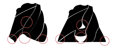

Fig. 6.13 Comparison of original extraction with attempt #4 letter "R", Week 3 (8/5/2024)
The letter "R" went through a whole transformation from the extraction. A lot of refinements were needed by adding a bowl, adjusting the vertical stems and the shoulder. It was one of the parts I struggled with and had to refer back to my reference a couple of times.

Fig. 6.14 Comparison of original extraction with attempt #4 letter "S", Week 3 (8/5/2024)

Fig. 6.15 Comparison of original extraction with attempt #4 letter "H", Week 3 (8/5/2024)
f) Further Refinements (Week 4)

Fig. 6.16 Attempt #5 Increasing gaps between strokes, Week 4 (15/5/2024)
In week 4, Mr. Vinod suggested to increase the gaps between the strokes because the gaps were too thin and it was not visible from a far distance. To counter the problem, I adjusted the gaps by using thick and thin strokes in some areas for more dimension. This was the first attempt so further refinements were required.

Fig. 6.16 Attempt #6 Increasing gaps between strokes, Week 4 (15/5/2024)
With the sixth attempt, more refinements in the strokes to achieve consistency.

Fig. 6.17 Attempt #5 compared to attempt #6, Week 4 (15/5/2024)
Attempt #5 - red outline; Attempt #6 - light gray
Based on the comparison, I did not really make any new changes to letter "A" because I was already satisfied with the way it looked.
 Fig. 6.18 Compiled process, Week 3-4 (16/5/2024)

Fig. 6.19 Original extracted letterforms compared to the final type design, Week 4 (16/5/2024)

Fig. 6.20 Final type design, Week 4 (16/5/2024)

Fig. 6.21 Letter "N", Week 4 (16/5/2024)

Fig. 6.22 Letter "A", Week 4 (16/5/2024)

Fig. 6.23 Letter "R", Week 4 (16/5/2024)

Fig. 6.24 Letter "S", Week 4 (16/5/2024)

Fig. 6.25 Letter "H", Week 4 (16/5/2024)
Fig 7.3 Supposedly Final Finding Type Week 4 (18/5/2024)
 Fig 7.4 Movie Poster Attempt #1, Week 4 (18/5/2024)
For this poster, I tried to integrate these letterforms together with the poster to ensure that it blends well together. However, I felt the poster was lacking a lot of things and did not turn out well. Based on Mr. Vinod's feedback, the image has a lot of blackness to it and it is better to reduce the opacity. Besides, the arrangement of the movie logos were also not up to par.

Fig 7.5 Movie Poster Attempt #2, Week 4 (18/5/2024)
In my second attempt, I transformed the image into grayscale and added some grains for special effects. This inspiration mostly comes from old television that showcase tv shows with grainy effects. With the same problem, it was lacking. At the same time, I was told the gaps between the strokes of the letterforms were too small to see from afar. Thus, I took a step back and continued refining the letterforms.

Fig 7.6 Original Picture Attempt #3, Week 4 (19/5/2024)

Fig 7.7 Final Type Design, Week 4 (19/5/2024)

Fig 7.8 Editing image process, Week 4 (19/5/2024)
Before I began, I started by editing to enhance the quality of the image. To enhance it, I adjusted the curves by adding anchor points that represents the shadow, mid tone and light.

Fig 7.9 Comparison before and after editing, Week 4 (19/5/2024)
c) Digitization

Fig 7.10 Progression poster #1, Week 4 (19/5/2024)
With a twist, I changed the letterforms into 3D effect to make it look like blocks of marshmallows. I also included some blurry effects underneath the letter "R" to add more texture and give off the sinking feeling. This way it feels more connected.

Fig 7.10 Progression poster (credits) #2, Week 4 (19/5/2024)
Once I was done with the letterforms, I proceeded to type in the credits.

Fig 7.12 Final Movie Poster (NARSH) JPEG, Week 4 (19/5/2024)
Recap
For this exercise, we are to explore 8 systems which are Axial, Radial, Dilatational, Random, Grid, Modular, Transitional and Bilateral in InDesign using the content given in the MIB. We were also instructed to watch the InDesign demonstration videos in the lecture playlist.
- Size 200 x 200 mm
- Colours: Black and additional colour
- Minor graphical elements
Week 1 Practical
Fig 5.1 Practical week, Week 1 (1/5/2024)
For the first week, I tested myself with the axial and the modular system. I tried to familiarized myself with the software by exploring different fonts and arrangements.
Visual Reference:
Fig 5.15 Visual Reference, Week 1 (1/5/2024)
Before I kickstart with the exercise, I looked up for some visual references to gain inspiration for each system.
Process and Further Exploration:

Fig 5.2 Axial attempt #1, Week 1 (1/5/2024)
Fig 5.2 Axial attempt #1, Week 1 (1/5/2024)
Axial system was one of the first attempts to accustom myself with the system and the rules. When I looked at the layout, it looked quite unbalance by taking most of the space on the left. Although it was quite straight forward, it took me quite a while to picture a good layout.
Fig 5.3 Axial attempt #2, Week 1 (1/5/2024)
I approached a different direction by placing the axial in the middle. It appeared more balanced and organized. I enlarged the title to create more emphasis however I realized that it could look heavier on one side compared to the other. The first layout turned out to be heavily dense with graphical elements so I tried to minimized it on the second one.
Font Used: ITC New Baskerville Std, Univers Lt Std, Bembo Std, ITC Garamond Std
Fig 5.4 Modular attempt #1, Week 1 (1/5/2024)
I began this task with the modular system. The system was quite simple and there were lots of exploration that could be done so I started with a simple composition on the left aside. It felt too simple so I started exploring more by adding more graphical elements.
Fig 5.5 Modular attempt #2, Week 1 (1/5/2024)
I decided to choose the second layout as my final modular system. To add more pop into it, I added colors to the topic for more contrast.
Font Used: Univers LT Std bold, roman; Bodoni MT
Fig 5.5 Bilateral attempt #1, Week 1 (6/5/2024)
To make the bilateral system more engaging, I attempted to put more emphasis on the title by using combinations of condensed, bold and italic fonts. I emphasized the bold on letter "p" and put them together to appear as it tried to rip themselves apart. I tried changing the style by adding different colors to the background.
Fig 5.6 Bilateral attempt #2, Week 1 (6/5/2024)
I was not sure which layout was the best option so I revised them by repositioning them and adding more graphical elements. In the end, I think the first layout resonated with me more and looked more decent.
Font Used: Futura Std light oblique, medium; ITC Garamond Std bold, italic, book condensed
Fig 5.7 Transitional attempt #1, Week 1 (6/5/2024)
The composition looks fun to me but I was not too confident with it whether there was too much negative space which can cause imbalance. I added a circle to tie the composition together by overlapping and attaching. I highlighted certain part of the text just to create more visual contrast.
Fig 5.8 Transitional attempt #2, Week 1 (6/5/2024)
I created a second attempt and this time I tried to use the whole space. I was a little confused with the concept of transitional but it was fun to work with because the outcome always looked pleasing.
Font used: Futura Std heavy, book, bold condensed, medium oblique; Univers LT Std; Gill Sans Std Ultra Bold
Fig 5.9 Random attempt and revised #1, Week 1 (6/5/2024)
When I thought of random, I thought of chaos and messy. Initially, I don't have any composition in mind but I thought of a torn ribbon bow. By going big and not go home, I added big, bold letters with different mixture of fonts to bring a large emphasis on the title. The initial layout felt like it needed more randomness so I added more repetitive elements into the composition to make it more compact. This system was particularly my favorite as it has more freedom to it.
Font Used: Mixture of 10 fonts
Fig 5.10 Grid attempt and revised #1, Week 1 (7/5/2024)
Font Used: Univers LT Std bold, ultra condensed, roman; Futura Std bold condensed
Fig 5.11 Radial attempt #1, Week 1 (7/5/2024)
My first attempt of radial is quite odd and too simple. I was not familiar with the composition and therefore both of the layout looked imbalance. I realized its hard to optimize it and it can looked out of place without realizing it during the process.
Fig 5.11 Radial revised #2, Week 1 (7/5/2024)
In this second layout, I thought of a half winged butterfly. I decided to revise on the second design by adding small titles at the opposite end and kerning them to look more stabilized.
Font Used: Futura Std bold condensed, heavy, medium, book
Fig 5.12 Dilatational attempt #1, Week 1 (7/5/2024)
I added more stylized font for the title in order to make it looked dynamic. I also adjusted the wordings so that it is more stable.
Font Used: Bodoni MT condensed bold, Futura Std bold condensed, medium condensed
Final Task 1: Exercise 1 - Typographic System
Fig 5.15 Final Axial System JPEG, Week 2 (10/5/2024)
Fig 5.15 Final Modular System JPEG, Week 2 (10/5/2024)
Fig 5.15 Final Bilateral System JPEG, Week 2 (10/5/2024)
Fig 5.16 Final Transitional System JPEG, Week 2 (10/5/2024)
Fig 5.17 Final Random System JPEG, Week 2 (10/5/2024)
Fig 5.18 Final Grid System JPEG, Week 2 (10/5/2024)
Fig 5.18 Final Radial System JPEG, Week 2 (10/5/2024)
Fig 5.20 Final Typography System, PDF Week 2 (11/5/2024)
Fig 5.21 Final Typography System (GRID), PDF Week 2 (11/5/2024)
Task 2: Exercise 2 - Type & Play
Part 1: Finding Type
In this next exercise, we needed to create a type referencing from nature or human-made objects. The goal of this exercise is to have a typeface that reflects certain elements of the object that makes it stand out. Then we need to take that type we created and make a movie poster from it. The image selected for the poster has to be related to the specific element we have initially chose and should have a symbiotic relationship between both the letters and image.
__
a) Chosen subject / image

Fig. 6.1 Chosen image - "Marshmallow", Week 3 (7/5/2024)
By studying the organic shapes and form of this picture, there are many potential for an interesting exploration. Through my observation, it was expected that the letterforms will be in thick strokes and lots of curves to deal with. I managed to identify five letters through this exercise which are (N,A,R,S,H).
b) Letterform Extraction
Fig. 6.2 Traced Letterforms, Week 3 (7/5/2024)
By proceeding with the extraction, I used a pen tool in Adobe Illustrator to trace the marshmallows by retaining the curved lines in between to ensure the extraction does not lose its original form of marshmallows.

Fig. 6.3 Extracted Letterforms, (N,A,R,S,H) Week 3 (7/5/2024)
From the extracted letters, I tried to find shapes that have some resemblance for my chosen letterforms. There are a lot of plays with the negative and positive space due to the gaps in between and lots of curves to explore with. I realized the extraction is quite unreadable.
c) Identifying a reference
Fig. 6.4 Gill Sans Ultra Bold ,Week 3 (7/5/2024)
d) Digitization
Fig. 6.5 Overall Look of Extraction ,Week 3 (7/5/2024)
Throughout the process, this is my overall outcome at refining the letterforms in Adobe Illustrator.
Fig. 6.6 Attempt #1, Simplified Letterforms, Week 3 (8/5/2024)
Due to its unreadability, I simplified the letterforms by adjusting the negative space and the positive space to make it obvious so that the letterforms are recognizable. To achieve this, I adjusted the anchored points and the curves.
At the beginning of the simplification, I found it slightly difficult to picture how would the letter 'R' looked like because the extraction of the letterform looked completely different.
At the beginning of the simplification, I found it slightly difficult to picture how would the letter 'R' looked like because the extraction of the letterform looked completely different.
Fig. 6.7 Attempt #2,Adjusting Heights, Week 3 (8/5/2024)
Fig. 6.8 Comparing with reference, Week 3 (8/5/2024)
To ensure that the height is justified, I made a short comparison based on the chosen reference.
Fig. 6.9 Attempt #3, Adjusting the thickness, Week 3 (8/5/2024)
At my third attempt, each of the letterforms have the same thickness based on the reference. I adjusted the weight of the stroke of the letterforms that looked imbalanced.
Fig. 6.10 Attempt #4, Additional adjustments (curves and spaces), Week 3 (8/5/2024)
At the final attempt, I made minor adjustments to the curves and spaces to exaggerate the details of the marshmallow and to implement some balance in the strokes while maintaining consistency.
Throughout the process, I did not really have any adjustments on the serifs (sans serif) and the refinements mostly relied on the positive and negative space. This is because a marshmallow did not have any sharp edges jutting out and it is mostly curved and fluffy.
e) Comparing Extraction and final attempt
Fig. 6.11 Comparison of original extraction with attempt #4 letter "N", Week 3 (8/5/2024)
The extraction of the letter "N" can be mistaken for a letter "H". Thus, I created negative spaces in between to form two vertical stems and a diagonal stroke between them.
Fig. 6.12 Comparison of original extraction with attempt #4 letter "A", Week 3 (8/5/2024)
The letter "A" was my favorite part to work with. It gave me a few options for the final look. I increased the thickness of the stem on both side to achieve balance and adding a crossbar by removing some positive space in the middle.
Fig. 6.13 Comparison of original extraction with attempt #4 letter "R", Week 3 (8/5/2024)
The letter "R" went through a whole transformation from the extraction. A lot of refinements were needed by adding a bowl, adjusting the vertical stems and the shoulder. It was one of the parts I struggled with and had to refer back to my reference a couple of times.
Fig. 6.14 Comparison of original extraction with attempt #4 letter "S", Week 3 (8/5/2024)
At the beginning, the letter "S" looked a bit stiff so I added more curves to its spine and a short beak. There are a few exaggerated curves that stuck out like a sore thumb and so I flattened them a little.
Fig. 6.15 Comparison of original extraction with attempt #4 letter "H", Week 3 (8/5/2024)
The letter "H" did not appeared to have two vertical stems and it was joined from the extraction. I separated the two by differentiating the gap lines and added a crossbar. By doing this, the two vertical stems appeared to be slightly different from one another. The challenging part was to balance the thickness of the stems because they always looked unidentical.
f) Further Refinements (Week 4)
Fig. 6.16 Attempt #5 Increasing gaps between strokes, Week 4 (15/5/2024)
In week 4, Mr. Vinod suggested to increase the gaps between the strokes because the gaps were too thin and it was not visible from a far distance. To counter the problem, I adjusted the gaps by using thick and thin strokes in some areas for more dimension. This was the first attempt so further refinements were required.
Fig. 6.16 Attempt #6 Increasing gaps between strokes, Week 4 (15/5/2024)
With the sixth attempt, more refinements in the strokes to achieve consistency.
Fig. 6.17 Attempt #5 compared to attempt #6, Week 4 (15/5/2024)
Attempt #5 - red outline; Attempt #6 - light gray
Based on the comparison, I did not really make any new changes to letter "A" because I was already satisfied with the way it looked.
Final Part 1: Finding Type
Fig. 6.19 Original extracted letterforms compared to the final type design, Week 4 (16/5/2024)
Fig. 6.20 Final type design, Week 4 (16/5/2024)
Fig. 6.21 Letter "N", Week 4 (16/5/2024)
Fig. 6.22 Letter "A", Week 4 (16/5/2024)
Fig. 6.23 Letter "R", Week 4 (16/5/2024)
Fig. 6.24 Letter "S", Week 4 (16/5/2024)
Fig. 6.25 Letter "H", Week 4 (16/5/2024)
Fig 6.26 Final Finding Type PDF, Week 4 (16/5/2024)
Part 2: Creating Movie Poster
Upon completing the letterforms, we will combine the letterforms with an image that is the basis of the extracted letters. The objective is to enhance/support the interplay between the letterforms and the selected visual. The text must be woven into a symbiotic relationship with the image.
__
__
1) Initial Posters


Fig 7.2 Original picture attempt #2, Week 4 (18/5/2024)
These pictures are founded in Pinterest. For my first few attempts, I looked through similar pictures that are related to marshmallow.

Fig 7.1 Original picture attempt #1, Week 4 (18/5/2024)

Fig 7.2 Original picture attempt #2, Week 4 (18/5/2024)
These pictures are founded in Pinterest. For my first few attempts, I looked through similar pictures that are related to marshmallow.
Fig 7.3 Supposedly Final Finding Type Week 4 (18/5/2024)
To create the poster, I used these letterforms that were supposedly to be my final design.
For this poster, I tried to integrate these letterforms together with the poster to ensure that it blends well together. However, I felt the poster was lacking a lot of things and did not turn out well. Based on Mr. Vinod's feedback, the image has a lot of blackness to it and it is better to reduce the opacity. Besides, the arrangement of the movie logos were also not up to par.
Fig 7.5 Movie Poster Attempt #2, Week 4 (18/5/2024)
In my second attempt, I transformed the image into grayscale and added some grains for special effects. This inspiration mostly comes from old television that showcase tv shows with grainy effects. With the same problem, it was lacking. At the same time, I was told the gaps between the strokes of the letterforms were too small to see from afar. Thus, I took a step back and continued refining the letterforms.
2) Progression on new poster
a) Chosen image

Fig 7.6 Original Picture Attempt #3, Week 4 (19/5/2024)
For my third attempt, I took a different direction by choosing a mug with a cup of cocoa. It sounds logical and delicious to put marshmallows in a cup of cocoa. This was also found in Pinterest.
b) Editing Image
Fig 7.7 Final Type Design, Week 4 (19/5/2024)
Once I have finished refining the new design, I used these letterforms into my design poster.
Fig 7.8 Editing image process, Week 4 (19/5/2024)
Additionally, I changed the hue and saturation by adjusting the color tone to bring more emphasis on the mug. To give off a calm and solemn tone, I added more shadows to the background.
Fig 7.9 Comparison before and after editing, Week 4 (19/5/2024)
c) Digitization
Fig 7.10 Progression poster #1, Week 4 (19/5/2024)
With a twist, I changed the letterforms into 3D effect to make it look like blocks of marshmallows. I also included some blurry effects underneath the letter "R" to add more texture and give off the sinking feeling. This way it feels more connected.
Fig 7.10 Progression poster (credits) #2, Week 4 (19/5/2024)
Once I was done with the letterforms, I proceeded to type in the credits.
Font used: ITC Garamond Std; Bodoni Mt regular; Sitka semi bold

Fig 7.11 Progression poster (movie logos) #3, Week 4 (19/5/2024)
Comparing from my previous posters, I included more production logos by using image trace and expand them to remove the backgrounds. While doing so, I transformed the colors of each logo into white.
Fig 7.11 Progression poster (movie logos) #3, Week 4 (19/5/2024)
3) Final Movie Poster
Fig 7.12 Final Movie Poster (NARSH) JPEG, Week 4 (19/5/2024)
Fig 7.13 Final Movie Poster (NARSH) PDF, Week 4 (18/5/2024)
FEEDBACKS
Week 4
General Feedback: Achieving a good movie poster requires the seamless integration of letterforms and background images. To reach this level, it is crucial to critically analyze your own work and identify areas for improvement by comparing it to industry-standard movie posters.
Specific feedback: The gaps in between for the font cannot be seen from afar. I suggest to make the gaps wider. For the poster, try to reduce the opacity of the image to reduce the blackness.
Week 3
General Feedback: The letterforms dissected should be representative by the chosen image. The reference typeface should be simple.
Specific Feedback: Good job. You can proceed with the poster.
Week 2
General Feedback: Ensure the design is readable and well-balanced, commanding the space effectively. When using a condensed typeface, pay close attention to letter spacing to maintain readability. If the text is already large, reduce its density—there's no need for it to be big, bold, and underlined simultaneously.
Week 1
General feedback: watch the lecture videos. Make concise and precise explanation on your design process.
REFLECTION
Experience:
In exercise 1, I was mostly worried about my limitations to think of creative layouts and probably making silly mistakes that went against the typography system. Due to my clumsy nature, I tend to overlook certain things that could affect the whole process. However, more ideas filled me and I was able to picture the layouts I desired. It wasn't smooth sailing as it is when you have a picture in mind but executing it with the final result turned out to be a huge bonkers. Random system is my most favorite as it completely disregards most of the rules. Its messy and chaotic, I like it. Dilatational system confuses me and its composition can get so complicated. It was always out of balance and took a while to make it feel connected.
In finding type exercise, I find it quite therapeutic and the whole idea of it. It's like dissecting different parts of an object and tweak it to make it look fresh and new. It is quite a useful skill to have to train us to create our own typefaces. When certain things do not go our way, it requires patience and determination. This exercise was the beginning step of training my resolve as a designer too.
Observation:
During my own leisure time, I tend to take a glimpse around my surroundings and find unique patterns wherever I can ever since this exercise started. I always ended up trying to dissect letters in my head as if it was a natural thing to do. It was to multitask and keep myself busy from boredom. Interesting.
Findings:
Sometimes through typographic system, it's like expressing your personality and putting yourself on a spotlight. I realized it when I thought of my favorite things in the middle of my progress. It requires a lot of play between font, spacing and layout. It is like creating an extravagant cat walk for a fashion show. It is a splash of art but even art needs rule to make it functional. Just like typography.
FURTHER READING
 Fig 8.1 Typographic Systems by Kimberly Elam (2007)
This reference was really important in helping create and explore unique layouts of different typographic system. It brings me a better understanding and a clearer vision on certain system that brings me difficulties. Through my observation, design principles are also essential to include in all systems.

Fig 8.2 Repetition (random system)
This confirms that repetition is necessary in the random system and it can give a more interesting layout for the overall composition. I included this technique and principle a lot in my random system.

Fig 8.3 Right and obtuse angle (radial system)
When I thought of radial, I immediately thought of circular motions or compositions. It was a useful reading to find that radial system does not limit itself to right and obtuse angles. This assisted me in composing my layout in radial system too.

Fig 8.4 Structure (dilatational system)
It's truly inspiring how the author can create interesting structures but sadly the process brings me trauma.
Comments
Post a Comment