Advanced Typography - Task 3 (Type Exploration & Application)

Ameera Rihana binti Remy Ansara
Advanced Typography / Bachelor of (hons) in Creative Media
Task 3 - Type Exploration & Application
LECTURES
Lecture: Refer to Task 1
INSTRUCTIONS
Task 3: Type Exploration and Application
Recap
Timeframe: Week 08 - Week 12 (Deadline Week 13)
Required Submissions:
- A-Z; Numerals; Punctuation
- Link to your .ttf font.
- 5 font presentations (1024 x 1024 px, 300ppi)
- 5 font applications (1024 x 1024 px, 300ppi)
__
1) Idea Proposals
In this particular task, we were assigned to create a font based on the three options given:
a) Creating a Problem-Solving Font: Design a font that tackles a significant issue or contributes to a solution in a specific field of interest.
b) Exploring Existing Letterforms: Investigate and draw inspiration from existing typefaces within the chosen area to create a unique font.
c) Experimental Design: Develop a font through innovative and unconventional design methods, pushing the boundaries of traditional typography.
Fig 1.1 Idea Proposal Slides, Week 9
My Idea Proposals
Ideation #1: The current logo's letterforms lack a frightening appearance, and the stroke weights are too thin to convey a sense of horror.
Ideation #1: The current logo's letterforms lack a frightening appearance, and the stroke weights are too thin to convey a sense of horror.
Enhance the letterforms by integrating more horror elements and adjusting the design to include serifs. The goal is to create a typeface inspired by the game "Little Nightmares" that evokes a more sinister and compelling atmosphere.
Ideation#2: The movie's typeface features Chinese calligraphy strokes resembling ink, resulting in interesting letterforms but lacking consistency and contrast in the strokes.Ideation#3: Designing square glyphs into typefaces. Most of the letters have some difficulty in reading and hard to distinct especially if it is customized to be used in a brand. Creating a unique typeface but also readable at the same time.
After I presented the ideas on the 9th week, I decided to go with the first idea, which was creating a horror font based on the "Little Nightmare" video game.
2) Additional Research / Collecting references
a) Tim Burton's Exploration

Fig 1.2 Tim Burton's Biography, Week 9
In order to gather more information about horror fonts, Tim Burton is famous for his thrilled and horror designs in the entertainment industry. Specifically, I looked up to his background and many achievements over the past year.

Fig 1.3 "9" Visual References, Week 9
Another research I made is to observe one of his directed movies called "9". This recalled back my childhood memories and it became one of my favorite show. I looked up for visual references regarding to the numbers as it had similar style to the font that I was creating. To learn more about the movie, I curiously read the character's bio and what are the personality traits they had.
b) Avant Garde Font Design

Fig 1.4 Avant Garde, Week 9
At the same time, this particular font perplexed me how it can fit both regular and italic fonts into one and the combination goes really well. It also has some sort of gothic look to it. I looked up a couple of references regarding to the typefaces.
3) Sketches


Fig 1.5 Sketches without grid (Uppercase), Week 9


Fig 1.5 Sketches with grid (Uppercase and numerals), Week 9
Rough Digitization
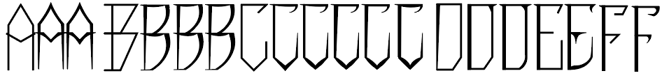
Fig 1.6 First attempt at digitization, Week 9
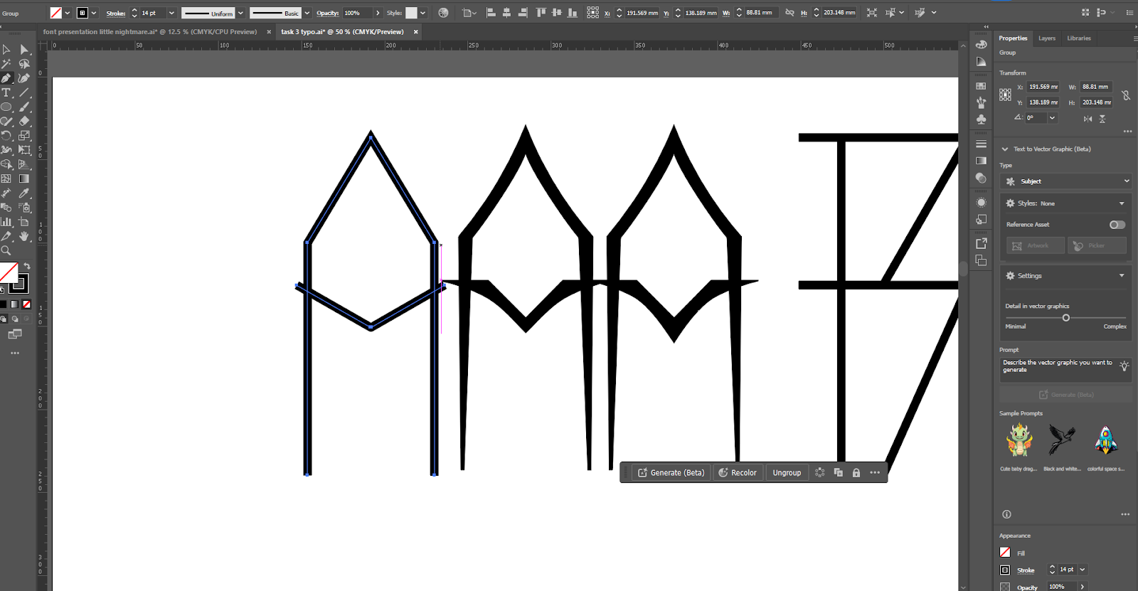
Fig 1.7 First attempt at digitization, Week 9
I had created two different sketches (with grid and no grid) in order to ensure some balance and consistency in the letterforms before I proceed with digitization. When I compared between the two, it really showed a lot of difference. I decided to refer sketches with grid to guide me in constructing proper letterforms.
4) Digitization
Rough Digitization
Fig 1.6 First attempt at digitization, Week 9
Fig 1.7 First attempt at digitization, Week 9
Once I have completed the sketches, I began digitizing my letterforms starting with the uppercases. I started off with letters A,B,C,D,E and F. To create these specific letterforms, I started using a pen tool in form of strokes and converted them into outline stroke (object bar) to turn into shapes. This allowed me to have both thick and thin strokes by adjusting the anchor points of the letter.
Fig 1.8 Improvement in strokes, Week 9
As I proceeded with my digitization, I realized that my letterforms were too thin too see. Thus I began to increase the strokes of the letterforms for readability.
Feedbacks and Adjustments

After receiving some feedbacks, these particular letters did not have consistency at the roof of the letters. In addition, the letter "I" might too seem decorative.
Therefore, I made some minor adjustments to the letters and took the feedbacks into consideration.

By taking one part of the letter, I adjusted the strokes accordingly by relating them to letter "C". Now, the strokes appeared to be more balanced and well defined.

Fig 1.9 Minor adjustments (letter I) #2, Week 10
Based on the feedback, I was conflicted on how to make the letter "I" because I didn't want to make it look too simple. So, I added some jutting out corners at the end and at the same time I toned down the decorative parts.
Uppercase Letters
Fig 1.10 Work Process of Uppercase Letterforms , Week 10
Fig 1.10 Work Process of Lowercase Letterforms , Week 11
Once I have completed my uppercase letters, I proceeded with the lowercases which were designed referred to the uppercases. To create the lowercases, I digitized them side by side in order to maintain consistency.

Fig 1.11 Overall Outline view of lowercase and uppercase , Week 11
Most of the time, it took me quite a while to handle the lowercase compared to uppercase. They all have unique features and looked completely different from their partner. The strokes in their tail such as letter "g" and "y" were slightly difficult to grasp consistency as some might have awkward bents or unnecessary curves.
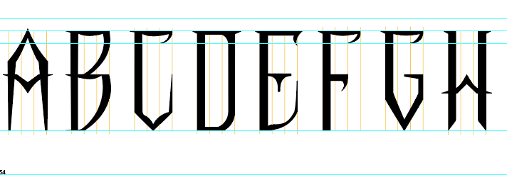
Finalized outcome uppercase & lowercase
Fig 1.12 Finalized Lowercase and Uppercase Letterforms , Week 11

Fig 1.13 Punctuations and Numerals work process , Week 11
Regarding to the numerals and punctuations, they were created with the same methods. I took a slight inspo from the movie "9" but still maintain the style of the letterforms with sharp edges and horror elements.
Finalized Outcome Numeral & Punctuations
Fig 1.14 Finalized numerals and punctuations , Week 11
5) Font Lab 7

Fig 1.15 Transferring letterforms into Font Lab 7 , Week 11
Once I have completed the digitization, I transferred them into Font Lab 7 to begin with the kerning process.
Kerning Process


Fig 1.16 Side bearing measurement table , Week 12
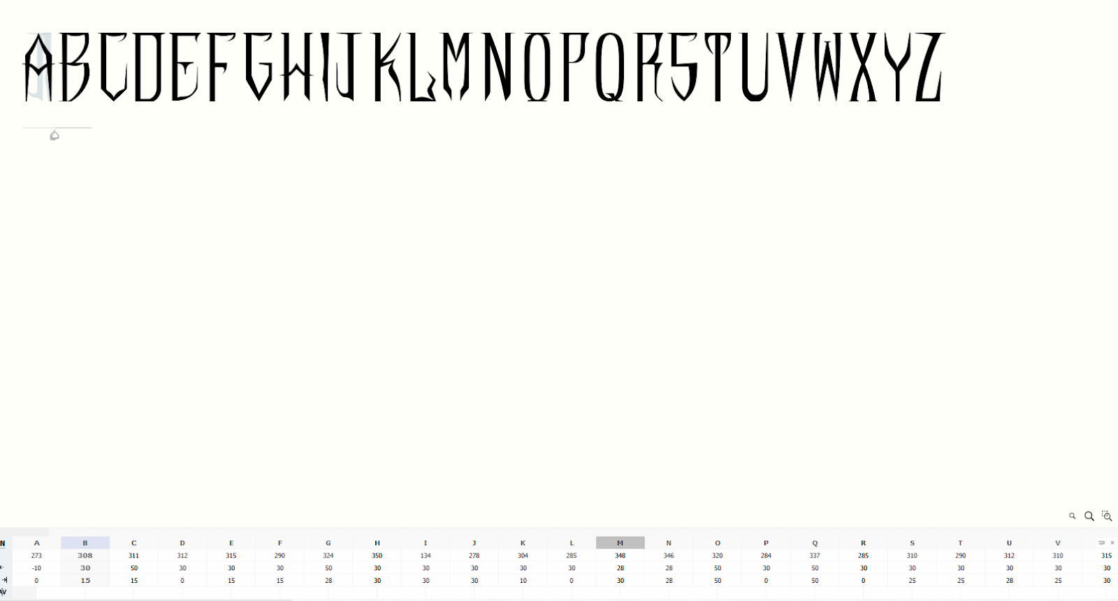

Fig 1.17 Uppercase and Lowercase Kerning , Week 12


Fig 1.18 Punctuations and Numerals , Week 12
Before starting the layout for my font presentation, I created a color palette to ensure none of the presentation looked out of the place.

Fig 2.1 Color Palette , Week 13

Fig 2.2 Initial attempts at font presentation , Week 13
Through the font presentation, I tried to encapsulate creepy vibes into the theme and by also relating it to the title of my font exploration. I purposely choose dark color schemes to blend in with the theme. I was testing out what letterforms I could used to include in the font presentation.

Fig 2.3 Second attempt at font presentation , Week 13
7) Font Application

Fig 2.4 More attempts at font application , Week 13
Task 3 Final Outcome
Click here to download LITTLE NIGHTMARE
Fig 3.2 Finalized Font "LITTLE NIGHTMARES" , Week 13

Fig 3.2 Font Presentation #1 JPEG , Week 13
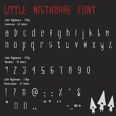
Fig 3.3 Font Presentation #2 JPEG , Week 13

Fig 3.4 Font Presentation #3 JPEG , Week 13

Fig 3.5 Font Presentation #4 JPEG , Week 13

Fig 3.6 Font Presentation #5 JPEG , Week 13

Fig 3.7 Font Presentation #6 JPEG , Week 13
Fig 3.8 Font Presentation PDF , Week 13

Fig 3.9 Font Application #1 JPEG , Week 13

Fig 3.10 Font Application #2 JPEG , Week 13

Fig 3.11 Font Application #3 JPEG , Week 13

Fig 3.12 Font Application #3 JPEG , Week 13

Fig 3.13 Font Application #4 JPEG , Week 13

Fig 3.14 Font Application #5 JPEG , Week 13
Fig 3.15 Font Application PDF , Week 13
FEEDBACKS
Week 13
General Feedback: Ensure that you choose a theme for your font application. For example, if you decide on a fashion theme, use fashion-related examples.
Specific Feedback: Make sure to follow the side bearings and adjust them based on the rule given.
Week 11
General feedback: Enlarge the lowercase letters so that they are visually balanced with the uppercase letters. Ensure that the lowercase letters are neither too small nor too large compared to the uppercase letters when placed side by side.
Specific feedback: Overall it looks good. The "L" and "K" looks perfect. Be careful with the "I" cause it might look too decorative. Just have more consistency in the strokes for "C","G","F".
Week 10
General feedback: When designing a font, always use a grid. Prioritize stroke width and proportions before customization. Establish and adhere to a consistent framework for your font, except for characters like "M" and "W". Begin with basic shapes to ensure consistency. Include a diagonal grid in your framework if your font is slanted. Maintain consistent thick and thin strokes, even for "bubbly" fonts.
Week 9
General feedback: The work process of the letterforms need to be rich.
Specific feedback: The idea is good to go.
REFLECTION
Experiences
Creating a new font was quite enjoyable for me because I had a clear vision of what I wanted to achieve. I was able to start the process immediately without the usual confusion or uncertainty. Having used FontLab last semester, I was already familiar with the software, so importing the font into FontLab was straightforward. However, I encountered some difficulties with the complexity of the file, which was more challenging than my previous work. While I aimed to progress quickly due to the approaching deadline, I remained committed to producing high-quality work. Ultimately, I am pleased with the results.
Observation
One significant observation during the font creation process was the careful consideration of the x-height. The x-height, which represents the height of lowercase letters without ascenders or descenders, played a crucial role in defining the font's overall aesthetic and readability.
Findings
As I worked on creating the font, I found it much easier to start the design process by focusing on letters like H, O, A, and N. These letters serve as excellent starting points due to their simple, straight, and horizontal lines. Beginning with these letters has practical benefits; their straightforward structural elements can be easily copied and adjusted to create other letters. This approach not only speeds up the design process but also helps maintain a consistent look and feel throughout the font.
FURTHER READING


Fig 4.2 Punctuations and accents
 Fig 4.3 Uppercase
 Fig 4.4 Lowercase
Comments
Post a Comment