Advanced Typography - Final Compilation and Reflection
24/4/2024 - 24/7/2024
Ameera Rihana binti Remy Ansara
Advanced Typography / Bachelor of Design (Hons) in Creative Media
Final Compilation & Reflection


Fig 1.1 Final Axial System JPEG, Week 2 (10/5/2024)

Fig 1.2 Final Modular System JPEG, Week 2 (10/5/2024)

Fig 1.3 Final Bilateral System JPEG, Week 2 (10/5/2024)

Fig 1.4 Final Transitional System JPEG, Week 2 (10/5/2024)

Fig 1.5 Final Random System JPEG, Week 2 (10/5/2024)

Fig 1.6 Final Grid System JPEG, Week 2 (10/5/2024)

Fig 1.7 Final Radial System JPEG, Week 2 (10/5/2024)
 Fig 1.8 Final Dilatational System JPEG, Week 2 (10/5/2024)
Fig 2.0 Final Typography System (GRID), PDF Week 2 (11/5/2024)
 Fig. 2.1 Compiled process, Week 3-4 (16/5/2024)

Fig. 2.2 Original extracted letterforms compared to the final type design, Week 4 (16/5/2024)

Fig. 2.3 Final type design, Week 4 (16/5/2024)

Fig. 2.4 Letter "N", Week 4 (16/5/2024)

Fig. 2.5 Letter "A", Week 4 (16/5/2024)

Fig. 2.6 Letter "R", Week 4 (16/5/2024)

Fig. 2.7 Letter "S", Week 4 (16/5/2024)

Fig. 2.8 Letter "H", Week 4 (16/5/2024)

Fig 3.0 Final Movie Poster (NARSH) JPEG, Week 4 (19/5/2024)


Fig 3.7 Final Key Artwork PDF, Week 6 (29/5/2024)


Fig 3.9 Key artwork expansion #2 JPEG, Week 7 (3/6/2024)


Fig 4.1 Key artwork collateral #2 JPEG, Week 7 (3/6/2024)

Fig 4.2 Self-portrait JPEG, Week 7 (3/6/2024)


Fig 4.4 Key artwork collateral #4 JPEG, Week 7 (3/6/2024)

Fig 4.5 Color Scheme JPEG, Week 7 (3/6/2024)

Fig 4.6 Key artwork expansion #3 JPEG, Week 7 (3/6/2024)


Fig 4.8 Final Animation Key Artwork JPEG, Week 7 (3/6/2024)

Fig 5.1 Font Presentation #1 JPEG , Week 13
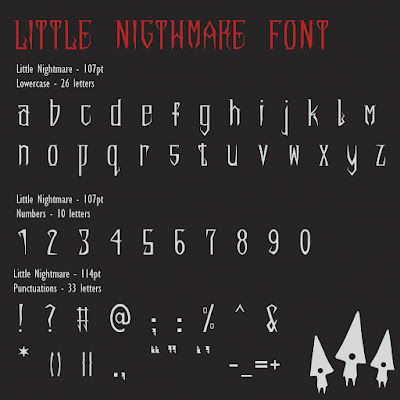
Fig 5.2 Font Presentation #2 JPEG , Week 13

Fig 5.3 Font Presentation #3 JPEG , Week 13

Fig 5.4 Font Presentation #4 JPEG , Week 13


Fig 5.8 Font Application #1 JPEG , Week 13

Fig 5.9 Font Application #2 JPEG , Week 13

Fig 6.0 Font Application #3 JPEG , Week 13

Fig 6.1 Font Application #3 JPEG , Week 13

Fig 6.2 Font Application #4 JPEG , Week 13

Fig 6.3 Font Application #5 JPEG , Week 13
Fig 6.4 Font Application PDF , Week 13
Ameera Rihana binti Remy Ansara
Advanced Typography / Bachelor of Design (Hons) in Creative Media
Final Compilation & Reflection
INSTRUCTIONS
Exercise 1 - Typographic System
Fig 1.1 Final Axial System JPEG, Week 2 (10/5/2024)
Fig 1.2 Final Modular System JPEG, Week 2 (10/5/2024)
Fig 1.3 Final Bilateral System JPEG, Week 2 (10/5/2024)
Fig 1.4 Final Transitional System JPEG, Week 2 (10/5/2024)
Fig 1.5 Final Random System JPEG, Week 2 (10/5/2024)
Fig 1.6 Final Grid System JPEG, Week 2 (10/5/2024)
Fig 1.7 Final Radial System JPEG, Week 2 (10/5/2024)
Fig 1.9 Final Typography System, PDF Week 2 (11/5/2024)
Fig 2.0 Final Typography System (GRID), PDF Week 2 (11/5/2024)
Exercise 2 - Type and Play
Fig. 2.2 Original extracted letterforms compared to the final type design, Week 4 (16/5/2024)
Fig. 2.3 Final type design, Week 4 (16/5/2024)
Fig. 2.4 Letter "N", Week 4 (16/5/2024)
Fig. 2.5 Letter "A", Week 4 (16/5/2024)
Fig. 2.6 Letter "R", Week 4 (16/5/2024)
Fig. 2.7 Letter "S", Week 4 (16/5/2024)
Fig. 2.8 Letter "H", Week 4 (16/5/2024)
Fig 2.9 Final Finding Type PDF, Week 4 (16/5/2024)
Fig 3.0 Final Movie Poster (NARSH) JPEG, Week 4 (19/5/2024)
Fig 3.1 Final Movie Poster (NARSH) PDF, Week 4 (18/5/2024)
2A - Key Artwork

Fig 3.2 Final Key Artwork (black and white) JPEG, Week 6 (29/5/2024)

Fig 3.3 Final Key Artwork (black and white) JPEG, Week 6 (29/5/2024)

Fig 3.4 Final Key Artwork (colored) JPEG, Week 6 (29/5/2024)

Fig 3.5 Final Key Artwork (colored) JPEG, Week 6 (29/5/2024)
Fig 3.6 Final Key Artwork (colored) JPEG, Week 6 (29/5/2024)
Fig 3.7 Final Key Artwork PDF, Week 6 (29/5/2024)
2B - Collateral and Animation of Key artwork
Fig 3.8 Key artwork expansion #1 JPEG, Week 7 (3/6/2024)
Fig 3.9 Key artwork expansion #2 JPEG, Week 7 (3/6/2024)
Fig 4.0 Key artwork collateral #1 JPEG, Week 7 (3/6/2024)
Fig 4.1 Key artwork collateral #2 JPEG, Week 7 (3/6/2024)
Fig 4.2 Self-portrait JPEG, Week 7 (3/6/2024)
Fig 4.3 Key artwork collateral #3 JPEG, Week 7 (3/6/2024)
Fig 4.4 Key artwork collateral #4 JPEG, Week 7 (3/6/2024)
Fig 4.5 Color Scheme JPEG, Week 7 (3/6/2024)
Fig 4.6 Key artwork expansion #3 JPEG, Week 7 (3/6/2024)
Fig 4.7 Screenshot of Instagram on desktop JPEG, Week 7 (3/6/2024)

Fig 4.8 Final Animation Key Artwork JPEG, Week 7 (3/6/2024)
Fig 4.9 Final Collateral and Expansion of Key Artwork PDF, Week 7 (3/6/2024)
Click here to download LITTLE NIGHTMARE
Fig 5.0 Finalized Font "LITTLE NIGHTMARES" , Week 13
Fig 5.1 Font Presentation #1 JPEG , Week 13
Fig 5.2 Font Presentation #2 JPEG , Week 13
Fig 5.3 Font Presentation #3 JPEG , Week 13
Fig 5.4 Font Presentation #4 JPEG , Week 13
Fig 5.5 Font Presentation #5 JPEG , Week 13
Fig 5.6 Font Presentation #6 JPEG , Week 13
Fig 5.7 Font Presentation PDF , Week 13
Fig 5.8 Font Application #1 JPEG , Week 13
Fig 5.9 Font Application #2 JPEG , Week 13
Fig 6.0 Font Application #3 JPEG , Week 13
Fig 6.1 Font Application #3 JPEG , Week 13
Fig 6.2 Font Application #4 JPEG , Week 13
Fig 6.3 Font Application #5 JPEG , Week 13
Fig 6.4 Font Application PDF , Week 13
REFLECTION
Experiences
In conclusion, advanced typography could be one of the most enjoyable thing in the world but also stressful when certain situations don't go your way. I think overall it was a fulfilling experience to challenge yourself through difficulties and set backs, releasing a sigh of relief and a nod of satisfaction when completing a work that ourselves created. In addition, this experience train ourselves to hone our skills and use them for future projects. It could also be a reminder, a reminiscence about painstaking and enjoyable work that we made by looking our past projects. Lastly, I am very thankful about Mr. Vinod reaching out to every student and giving valuable insights with harsh critics but also become the key to our success.
Observation
Sometimes rules aren't meant to be broken. Specifically in Task 1 Exercise 1, the project relies on certain multitude of rules governing typography. and it took me a great time to understand them. But by understanding them, it becomes more appealing and profound that maybe it could evoke certain emotions. In addition, the typographic system exercises have been eye-opening, revealing numerous possibilities for crafting dynamic typography posters.
Findings
When it comes to creating gaps between strokes, I have lost a sense of intuition from time to time amidst doing Task 1 Exercise 2 and Task 2A. It requires attention and focus to ensure that everything remains consistent. It might seem decent but along the way you lose track of it. By creating collaterals or merchandises, it teaches us to create a brand for ourselves, influencers or celebrity. If we are to create a font in the future, we could apply typography skills to assist us in the endeavor.
Comments
Post a Comment